GAGA TOAST || This Toast-Themed Cafe was Designed with Carb Lovers in Mind
You had me at toast.
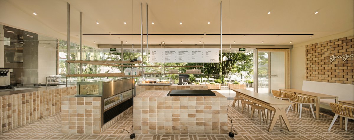
Shanghai-based architecture firm dongqi created a custom brick that closely resembles the crispy crust of a perfectly made toast as a key construction material for this bakery in Shenzhen.
dongqi turned a building in Shenzhen into a new concept bakery and developed its visual identity. The team named the space GAGA TOAST and proposed a ‘More Than Toast’ narrative. GAGA TOAST is not only a bakery that offers delicious toast, but also a gathering space full of toast elements.
The sides of the bricks are designed to resemble the crispy edges of a fresh slice of toast.
Enjoy a slice of heavenly toast on the terrace with lush greenery and the aromas of freshly baked toast wafting out from the kitchen.
Toast elements permeated the space, with the design centred around a specially shaped brick. The creative team worked closely with the architects to infuse the fundamental component of the visual identity as it conveyed the brand’s belief in authentic ingredients.
Both being shaped in a metal mold and produced in a high-temperature environment, brick-making is intrinsically related to toast baking. Also, as a heat-insulating material, the brick setting implies an atmosphere of bread baking.
The toast pattern can be found on the flooring, tiles and brickwork.
“Toast to life. GAGA TOAST.”
The custom designed bricks are made to defy the perceived notion of brick material being rustic and historic. In this scenario, the bricks give off a fun and playful vibe with its intentional, curved shape.
The heat creates a textural difference between the edge and center of the brick, which coincides with the appearance of a toasted crust.
Working closely with craftsmen, dongqi created a unique toast texture on the brick surface. One look at the serving counter's surface shows the resulting bricks' unique texture.
Different combinations were designed for various functions and applied throughout the entire space----from the wall to the floor, from the counter to the merchandise display, and the moveable retail fixtures.
The team preserved the original metal mold used to create the toast bricks as a merchandising display.
The team retained the original toast shape mold as a merchandising display.
dongqi's branding approach carries on the ‘More Than Toast’ experience of customers. Under a carefully curated colour scheme, the customized shape was extended into a toast-fitting pattern system, which helped turn the bakery into a space of toast.
You could say that the interior element outlines are ‘to scale’ with an actual slice of thick toast from GAGA TOAST.
The brand-owned monograms, patterns and graphics were generated and applied to various touch-points ranging from print materials to digital content, from furniture to promotional materials, from packaging to products - almost everything you can imagine. The visual language is friendly, bold and delicious, encouraging people to gather together for a chat over freshly baked toasts.
This unique design approach closed the gap between the brand experience and the spatial experience, making GAGA TOAST an ideal place for gatherings, inspiration, laughter, and, simply, a good life.
What better way to celebrate the precious moments we have together than to break bread?
The toast outline permeates every aspect of the brand, from the interior material elements to the packaging and design.
PROJECT DETAILS
Project Team: JIANG Nan, Yuan Yuan, Xie Jinfan, Shuang Zhang, Song Jie, Kiko Yuan, Xian Min Chia, Timothy Cheng
Photography: Raitt Liu
Project Size: 170 m2
Location: Shen Zhen Shi, Guang Dong Sheng, China
Completion Date: 2019
Architecture and Identity Design: dongqi Design栋栖设计

