BIIIRD YAKITORI || This Yakitori Restaurant's Innovative Design Kills Two Birds with One Stone

Don't judge a book by its cover.
This is how one would feel about Biiird Yakitori, a Japanese restaurant with a cool concrete facade with its entrance marked by a single lamp over a metal door the same colour as the surrounding concrete.
A nondescript doorway the same colour as the surrounding concrete opens to the cozy dining room.
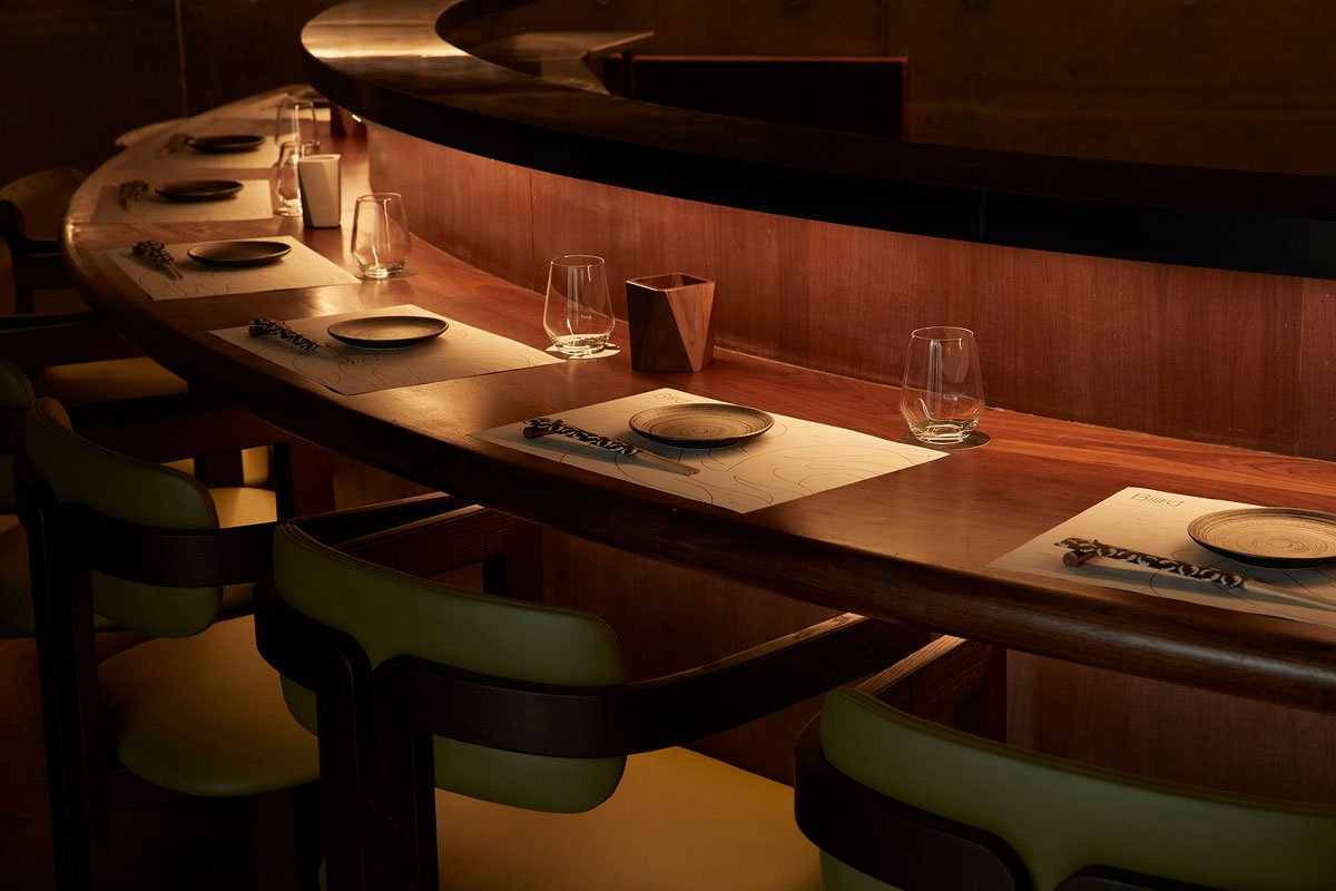
It is a different story once you open the door. A warm, welcoming glow and lively chatter spill out from the entrance. The seating is set out in a U-shaped bar, with a mass of red brick with a fluid design that looks like it is slowly pouring down from the ceiling. The tapered form connects with the bar, and uplighting establishes this brick wall as the dining room's centrepiece. An entryway on the brick wall side leads into the kitchen, where the heart of the operation lies.
The illuminated red brick wall is the focal point of the dining room and has a fluid appearance that makes it look as if it’s pouring out from the ceiling.
The posh dining space wrapped around the kitchen resulted from a design challenge with the project site. When the bigER club design team did their initial site inspection, they wanted to knock down the walls between several connected units to create a larger space. However, after the walls came down, they discovered massive concrete pillars they couldn't move. After analyzing the space, the team devised a solution to hide the pillars in the kitchen area. The intimate dining room with bar seats surrounding the kitchen encourages socializing and mingling. Placing the kitchen close to diners also increased efficiency because food arriving from the kitchen is still piping hot for patrons to enjoy. Not only did the team overcome the design challenge, but they also hit two birds with one stone.
The interior design aligns with the vibe of Yakitori, a street food popular in Japan as Yakitori Stalls, which evolved into Yakitori restaurants. Skewers of meat, vegetables, and more are cooked over an open charcoal fire. Guests seated around the kitchen are treated to the delicious aromas of grilled meats as they sip their refreshing beers after a long day.
The team reimagined the residual space as a social and resting area with stairs leading up to the VIP room.
When the designers connected the different commercial units, they discovered that some spaces featured soaring double-height layouts. While still connected to the main dining room, this residual space is repurposed as a resting and social area, featuring arches punctured into the walls that double as a seating area. The same space has a staircase that leads to an intimate VIP room, which feels like a smaller edition of the ambiance below.
The VIP room upstairs presents an even more intimate dining experience.
Not only did the bigER team manage to navigate the challenges of executing their design within the confines of a commercial structure, but they also managed to creatively reimagine such limitations to devise new ways for people to interact with the space.
Restaurant exterior with a window cutout looking into the rest area.
PROJECT DETAILS
Project Name:Biiird Yakitori
Project Client: Shenzhen Benmu Dining Management Ltd.
Project Location: Floor 1 10-13, block 3, Sky Park, Hongli-west Road, Futian district, Shenzhen,Guangdong, China
Project Area: 274 square meters
Completion Date:June 1, 2022
Design Company: bigER club design
Chief Designers: Cheuk Chun Yung, Huang Yuan
Photography: Wu Siming


