FICUS APARTMENT || This São Paulo Residence in a 1970s Building is Given a Contemporary Facelift

The Ficus Apartment in São Paulo, Brazil, was renovated with a contemporary layout to adhere to the owner’s love of gathering friends and hosting parties.
The original floor plan had a large staff room, three bedrooms, an isolated kitchen, and a small living room. The owner didn’t need a staff bedroom, and she wasn’t a fan of cooking, but she was a big fan of bringing friends and families together in her home; thus, the Angá Arquitetura team set out to update the residence to align with her desired lifestyle.
When the word contemporary is used, we often picture a spacious home with elegant materials, but the style sometimes doesn’t appear inviting. This is not the case for Ficus Apartment, where every section is tailored to the owner’s love of hosting her friends. The design encourages socializing in every aspect, using a material palette that exudes warmth and a considered flow in the design program to establish an inviting atmosphere.
After removing the original third bedroom and staff quarters, the residence had more room to enlarge the social and entertaining areas of the home.
Let’s start with the entrance hall, where there is a storage area to place keys, bags, coats and other items you would want out of your hand as soon as you are in the door. After an evening of fun and conversation, a bench by the door lets guests sit comfortably to take their shoes off or put them on. We’ve all attended parties where twenty or thirty pairs of shoes are strewn across the entrance area, and there’s nowhere to put our shoes on, so we hobble to the nearest wall for support. Although a small detail, the bench is a thoughtful touch.
The entrance hall storage niche lets the owner place their keys, hang their bag and coat upon returning home. A small mirror lets them fix their appearance before heading out for the day.
The kitchen and dining area are transformed with an open layout, countertop dining, and thus a much larger socializing and entertaining area. Although the owner doesn’t like to cook, she could still entertain guests with charcuterie platters and wine on the kitchen countertop. The taller counter also serves to hide a potentially messy sink. Those who cook and clean know these steps sometimes don’t happen together. When you’ve already exhausted yourself putting together a meal, the dishes are in the sink or the dishwasher until after everyone leaves, so it’s nice to have some shelter for the mess.
The kitchen is much cozier and in a shade of forest green. The countertop is great for cocktails and snacks before dinner, or a quick breakfast in the morning.
The dining area houses a dining table for eight, with an illuminated storage niche that could be well used for floral arrangements, art pieces, or where glasses are placed while guests stand and mingle after dinner. A large wine fridge is tucked away off the side of the dining table, so it’s easy to keep the conversation and drinks flowing throughout the evening.
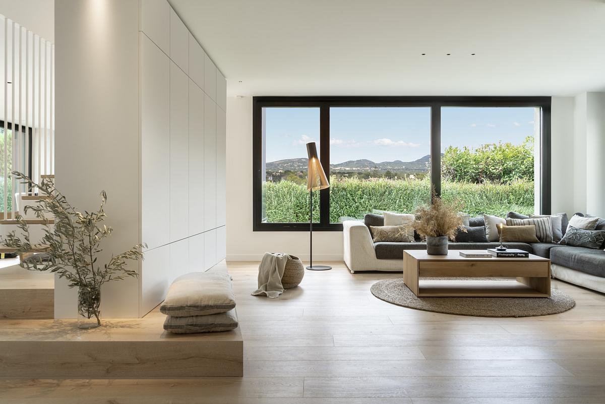
After dinner, guests can move into the living area to catch a movie or continue the conversation. A large slatted panel accented with lush greenery extends throughout the living room and dining area, bringing unity to the interiors. The multi-functional piece also houses a TV rack, technical closet and storage and hides the access door to bedrooms. This design makes the entertaining area seem cozier, without additional hallways to distract from the party in the living and dining area.
The slatted wall offers a clean and integrated storage solution both visible and invisible.
The marble slab that wraps around the slatted wooden panel serves multiple purposes.
Another use of the curved marble slab that runs along the slatted panel is to house drink glasses as guests socialize. The interior is designed with multiple spots for guests to engage with each other: the kitchen bar table, dining table, living room sofa, and even by the slatted panel entertainment wall.
In the owner’s bedroom quarters, the team has redone the master and guest bedrooms to provide storage and flexibility. A walk-in closet in the master bedroom is outfitted with a mirror perfect for the host to get ready for parties, while the guest bedroom closet serves as storage for the owner’s winter clothing. An integrated work and makeup desk by the bed is the perfect spot to get work done or get ready for the day. Hidden compartments store jewelry and makeup.
The spa-inspired master bathroom features natural stone cladding and a designed storage niche with ambient lighting for cosmetics and perfumes. After an evening of hosting and socializing, this is a private haven where the host can relax and unwind after the party goes late into the evening.
A custom storage niche in the natural stone cladding shower. Gentle illumination invites the owner to unwind.
PROJECT DETAILS
Project Size: 135 m2
Project Location: São Paulo
Completion Date: 2022
Photographer: Carolina Lacaz
Project Team:
Camila Caiuby
Gabriela Panico


