ANNA'S HOUSE || Space-Efficient and Sustainable Home Design

Situated on a small site with close neighbours, Anna’s House is a cozy and space-efficient home designed with sustainability in mind.
To Anna, having a simple and comfortable home that respects the environment is key. Having resided in the original charming yet aged Brunswick weatherboard workers cottage, Anna sought out Australia-based Architect Studio, Gardiner Architects, to transform the tired period home into the home of her dreams. The original house, located on a quiet tree-lined street in Brunswick, was small, dark, with low ceilings and no insulation. Along with being freezing in the winter and hot in the summer, the house offered no connection to the outside. Hoping to live in a space with a stronger connection to the surrounding neighbourhood, Anna’s brief included the priorities of comfortably-sized living areas that flow seamlessly into the outdoor garden space, as well as self-efficient features that will minimize the impact on the environment.
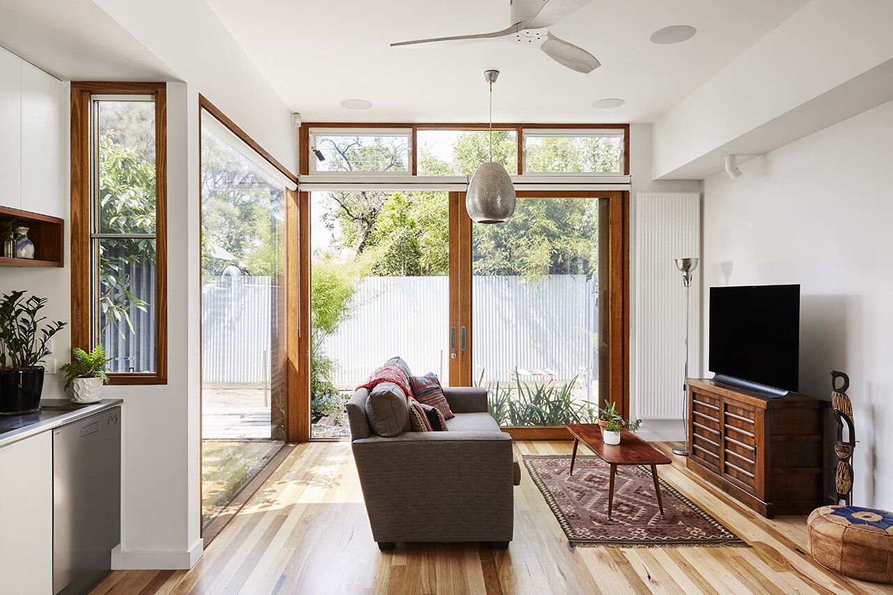
The resulting design allows the living space and gardens to feel open, spacious, and bright - a contrast from the dark, narrow and closed-off interior of the original home.
The bright and airy living room
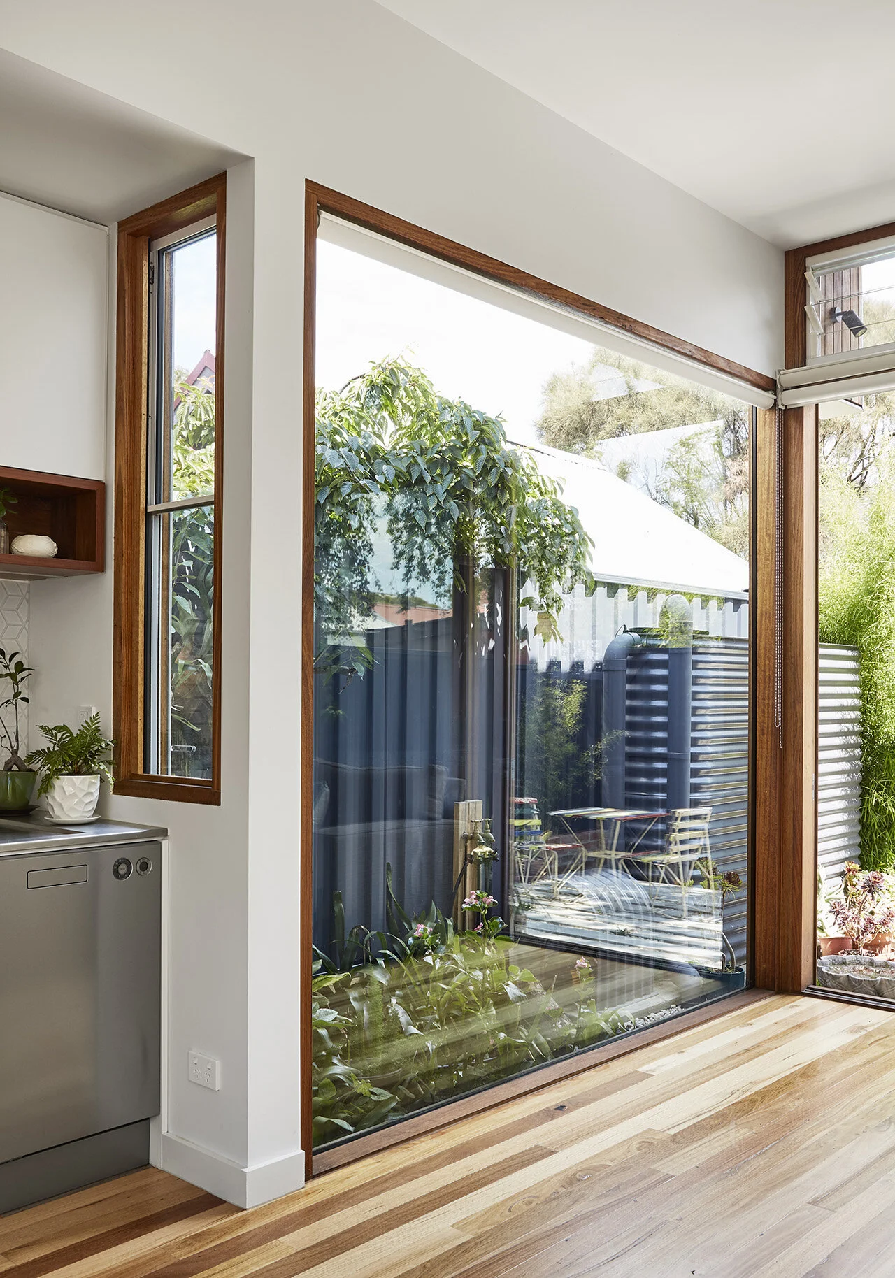
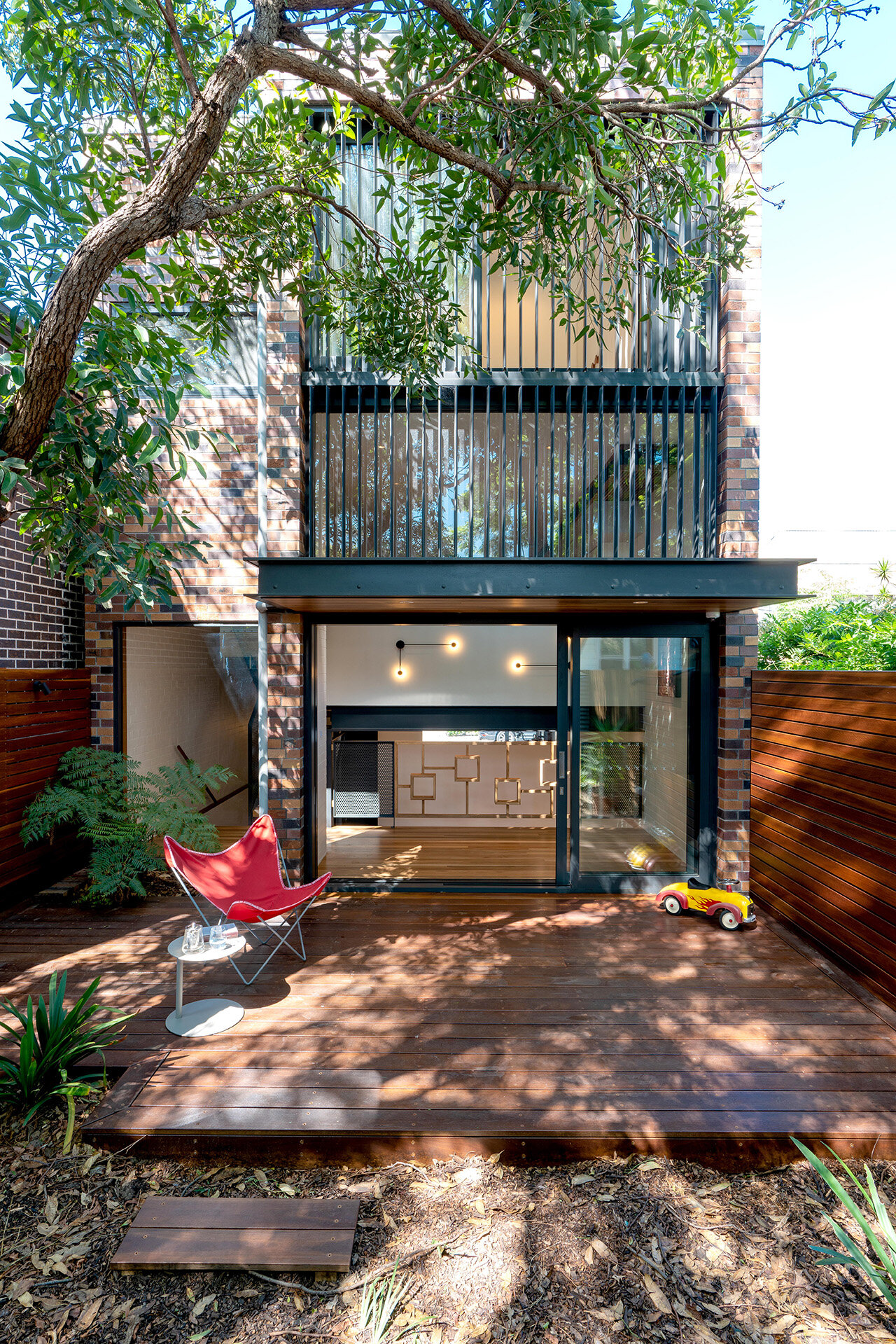
The new design connects seamlessly to the outdoors
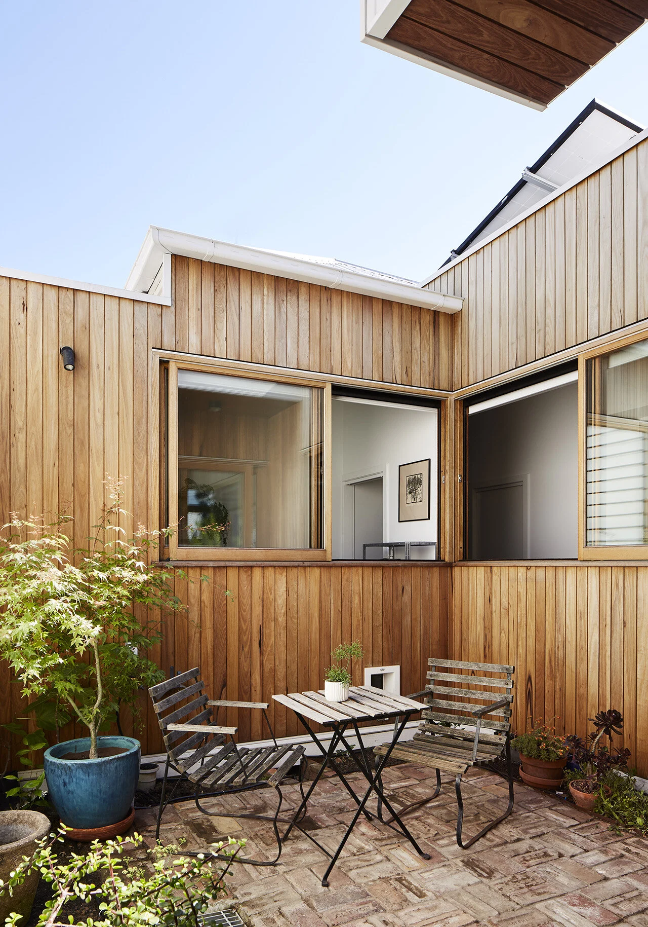
A backyard patio to enjoy the sun
Anna’s interest in finding sustainable solutions to create a home with low environmental impact inspired the incorporation of solar design principles to catch the northern light, which ensures that the interior doesn’t overheat in the summer. Remodelling the existing structure and reusing many of the original building materials rather than building a completely new structure also aligns with Anna and Gardiner Architects’ values in sustainability.
In order to tailor the various sustainable designs to Anna’s lifestyle without impeding too much on the overall budget, the design team employed creative solutions such as upcycling building materials as well as increasing home efficiency by positioning the windows to the north to avoid the hot afternoon sun from the west. A concrete slab for thermal mass was also added to help maintain the indoor temperature, while solar panels and water tanks assist to reduce electric and water usage, lowering the overall cost of running the home in the long run.
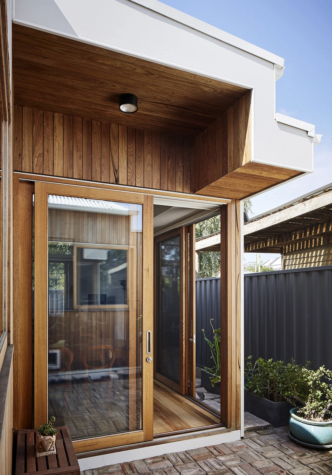
Sliding doors leading out to the garden
“Anna had minimal, subdued requirements. Two bedrooms, a single bathroom, a European style laundry and a separate study. Luxuries like an ensuite or a separate laundry weren’t too important to her. In this way, the design evolved to be the space-efficient form it is, allowing the priorities of comfortable sized living areas and garden space to take reign irrespective of the restricted size of the site.”
Extra large windows in the living space maximize the indoor outdoor connection
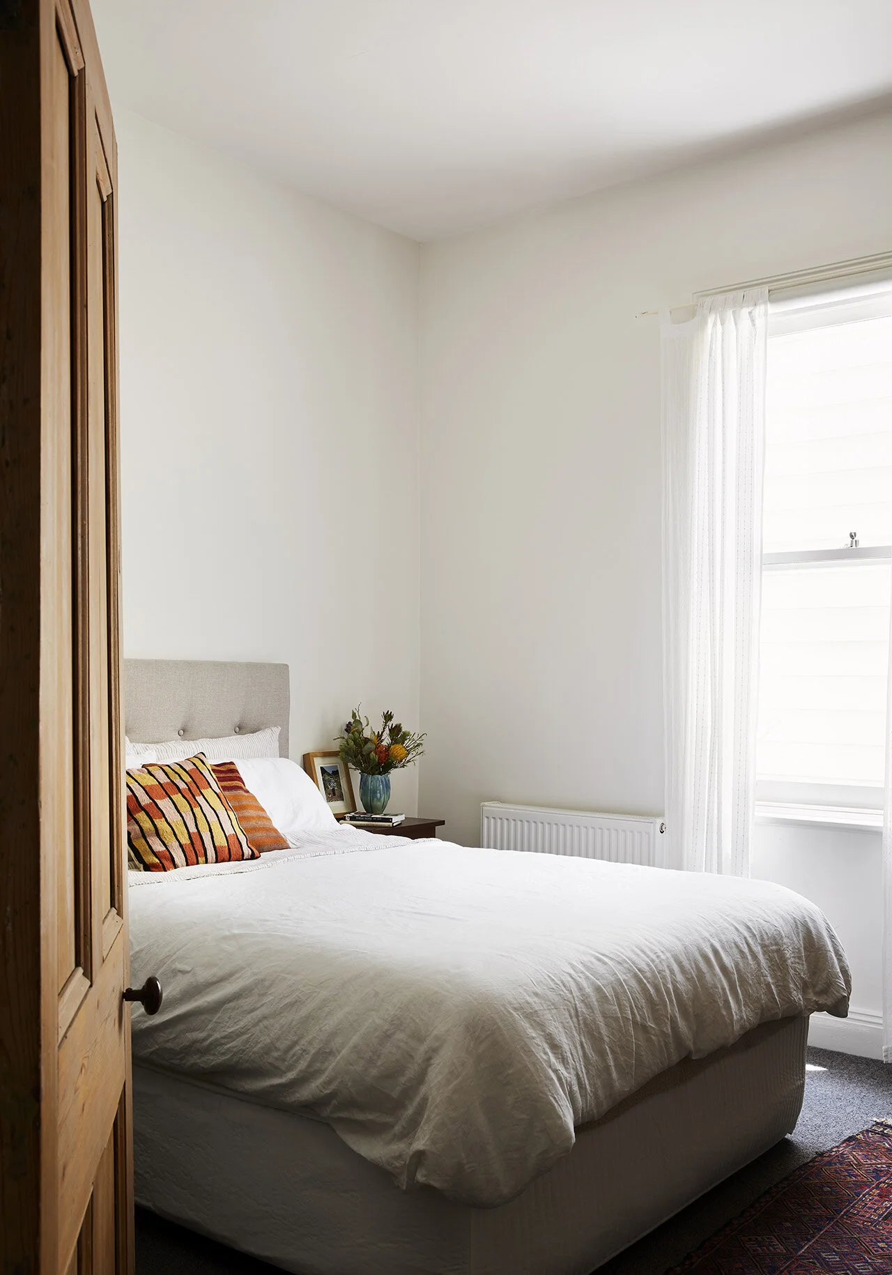
Cozy bedroom complete with vintage furniture
Anna felt strongly about having the front of the house restored to match the period features of the adjacent terraces. To accommodate this, the design team removed the 1970’s concrete porch and added a timber deck and bullnose roof to retain its original charm and character. The original weatherboards were also repaired, and the solid, heritage section of the house to the front was retained and only fixed as needed.
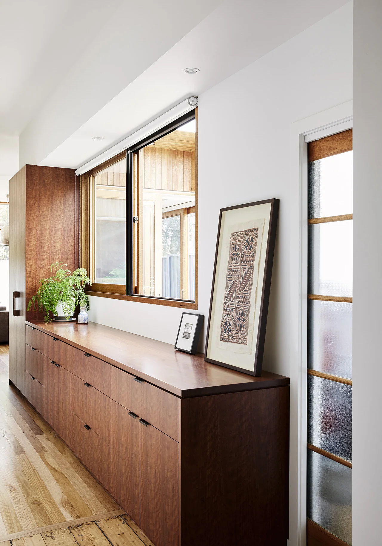
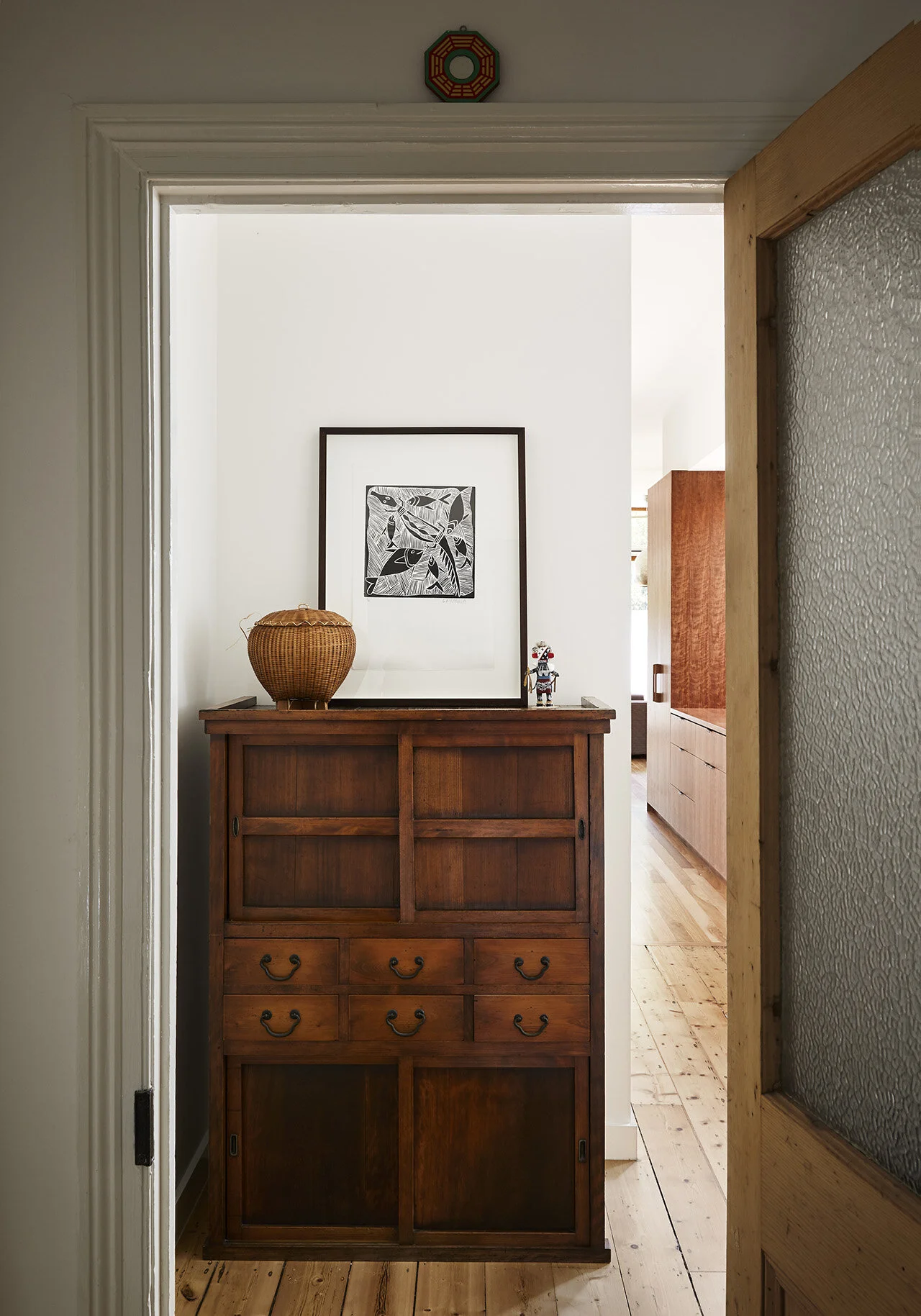
Upon entering the home from the front entrance, you will be welcomed into a rustic hallway with access to the front two rooms that have been retained from the previous structure. The corridor that connects the old to the new sections of the house has a separate washroom, a large closet door opening up to a European-style laundry, and extra storage space on each side. Additional service areas are created as a space-saving tactic to provide more storage and workable counters for small footprint homes. Usable bench space with drawers runs under the window along the corridor, which can be used as an extension to the kitchen space.
The corridor and study are designed to look into the lush courtyard, providing a sense of tranquility while allowing more areas of the house to connect to the outside. To create an airy living space that can be filled with natural light, the design team also raised the ceiling and incorporated an open plan design to instill a sense of spaciousness.
The vintage front entrance of the house and beautiful archway
“We see value in not only retaining but celebrating and preserving heritage buildings regardless of whether regulations enforce this or not. Keeping construction materials already in use has to be one of the most effective and sustainable things to do.”
Corridor that extends into the living area
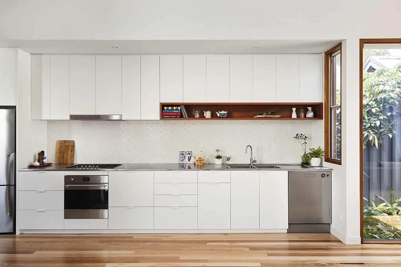
The kitchen is designed with plenty of storage space
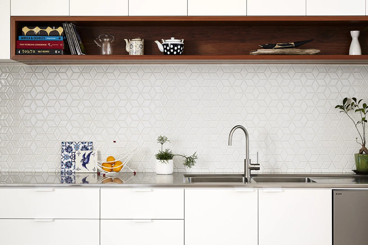
A distinct, patterned kitchen backsplash
The visual aesthetics of the interior were mainly inspired by Anna’s large, existing collection of old furniture and art. The collection consisted of sentimental pieces passed down from her family as well as relics from her travels around the world, which collectively encompass a warm and rich aesthetic. As a result, warm honey-toned timber flooring and cabinetry were incorporated along with predominantly white walls. This simple and neutral pallet allows Anna’s art and furniture pieces to add character to the various spaces. “We weren’t seeking a minimalist approach, just a backdrop for all her beautiful belongings to sit within”, says Gardiner Architects.
Additional counter space and storage area
“Unfortunately in Australia, we don’t have adequate systems that see demolished materials sorted and sufficiently reused and recycled. So we say, don’t knock it all down. We also value new expression in the new architecture. Rather than extending the same roofline or using the same materials for the new area of the house, we like to find a way to relate to the old without replicating a period aesthetic. We say make the decision about what you replace and what you rebuild, where you draw the line and what you value.”
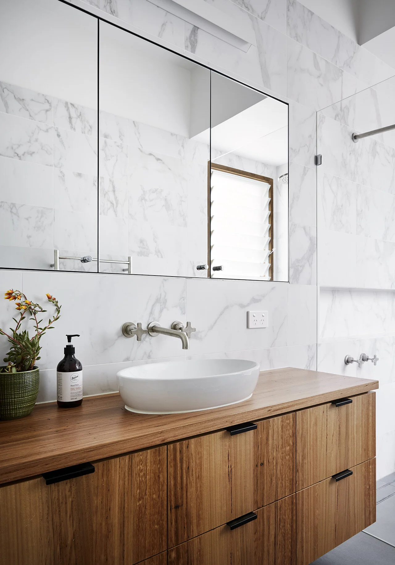
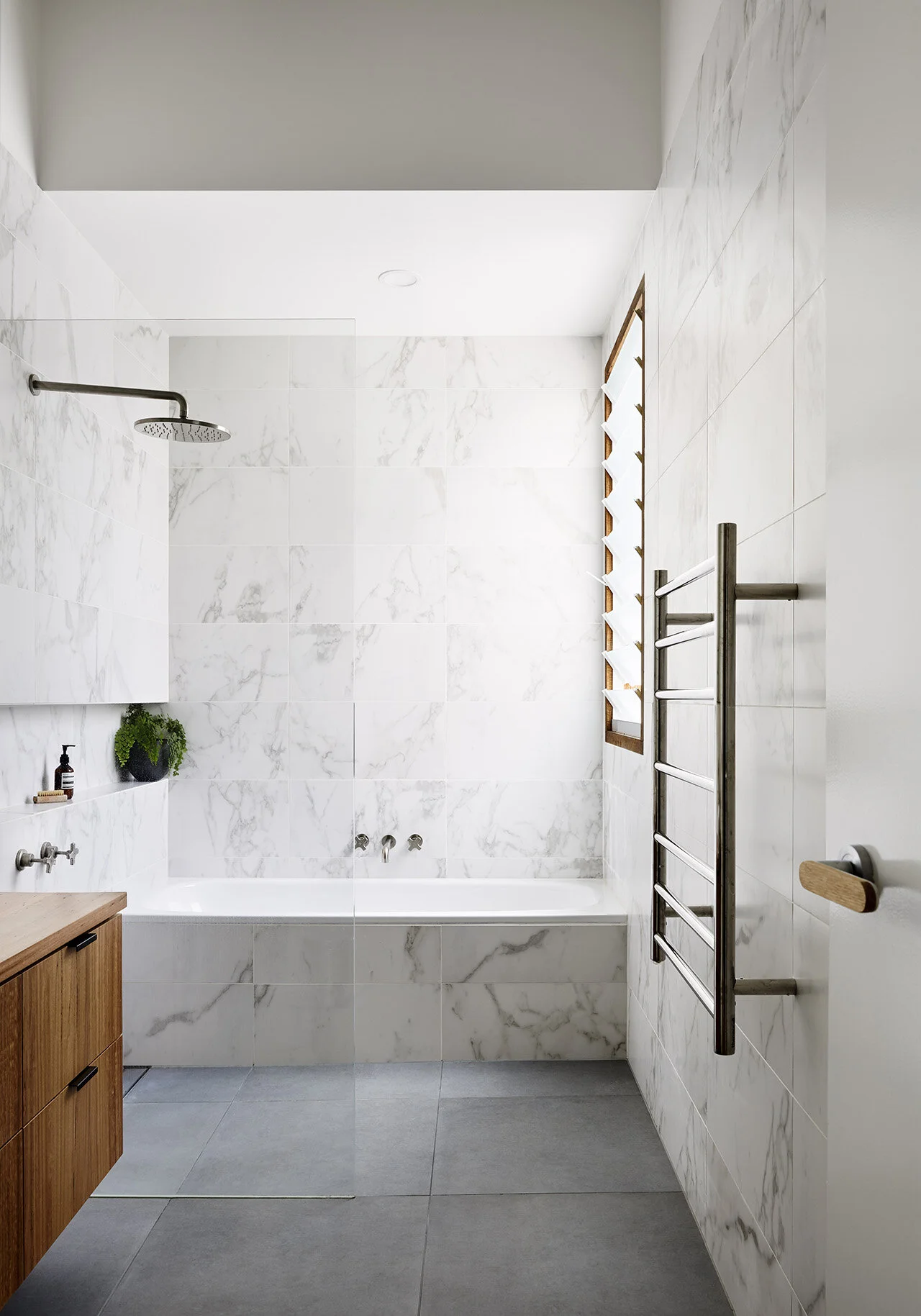
Marble-clad bathroom design
Through the like-minded values of both Anna and Gardiner Architects, the resulting project is not only an exhilarating home tailored to Anna’s individual lifestyle, but also a wonderful example of sustainable designs that can both maximize home efficiency and decrease environmental impact.
Efficient storage spaces
Large tree at the front of Anna’s House
Project Details
Project Name: Anna’s House
Completion Date: 2019
Project Size: 110 m2
Site Size: 195 m2
Design Team: Gardiner Architects
Photography: Tess Kelly

