OPASLY TOM RESTAURANT || Immersive Dining with Dramatic Colors and Textures

Opasly Tom, a refined contemporary Polish restaurant that enchants diners with its dramatic palette of rich colors and textures, is nestled in the heart of Warsaw.
The upscale restaurant is designed by an award-winning Poland-based design studio, Buck.Studio, which specializes in creating immersive brand experiences in the hospitality and retail sector. The design team was faced with a challenge to transform the multiple volume and split-level layout of Opasly Tom into a cohesive brand experience that will not only bring refreshing aesthetics to guests with an impressive interior, but also tie in with the restaurant’s modern Polish cuisine that embraces the concept of ‘slow food’, seasonality, and quality produce of Polish regions.
The design team chose a series of rich and luxurious colors comprising of nature-inspired shades, including sage green, coral, honey and ink blue to give each split level of varying sizes and heights its unique and individual character without detaching from the original theme. The result is a dining experience that can be tailored to your occasion and needs, whether you are looking for a bright and cozy space for weekend lunch with the family or a formal and elevated setting for a special night out.
The totem-like pendant light installation.
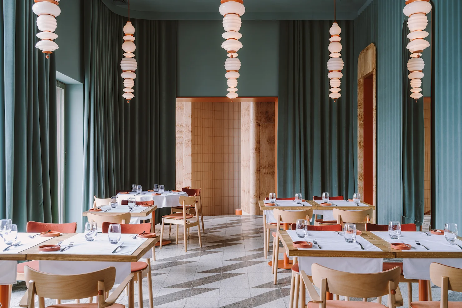
Each of the three distinct dining spaces in the restaurant offers a unique experience based on its unique color scheme. On the upper floor, a bright and airy setting with textured, rich sage walls makes it the perfect venue for formal gatherings and special celebrations. Guests can also enjoy the picturesque view of the historic buildings of Warsaw through the large windows on one side of the wall. On the other side of the dining hall, one can enjoy the stunning views through an arrangement of floor mirrors strategically positioned to reflect the opposing windows’ views.
A dramatic backdrop with a velvet, curtain-like texture created from upholstered corrugated steel cladding further elevates the dining experience by evoking a sense of luxury. Bespoke lighting installations, the ‘sorpel’ pendants, feature a string of glass spheres varying in size, stacked on top of one another, creating yet another visual cue to complement the minimal aesthetics of the dining hall. Honey-colored wood and bright coral of the upholstered dining chairs invite guests to sit down by adding a hint of warmth and a sense of comfort against the cool sage-toned walls and geometric terrazzo floors.
The top floor dining hall is entered via the foyer highlighted with an impressive poplar burl wood cloakroom where guests can leave their coats before entering. Beautiful wood patterns add authenticity and natural texture to the foyer, with similar materials being used throughout, from the bespoke drawers on wheels, to the tall coat cabinet, to the surrounding walls. The foyer also offers direct access to the bar and reading room where one can enjoy a selection of handcrafted cocktails. A hidden room called the ‘Oasis’ is accessible through the foyer, where a single table awaits for an intimate dinner session. An art-deco inspired setting with a similar poplar burl wood-clad wall and original floral patterned wallpaper took references from the history of the building, which originally housed a restaurant and a cabaret before World War II.
The private dining room.
The lower level of the restaurant bustles with energy, offering a more approachable setting for casual gatherings. Here, diners can peer into the semi-open kitchen to see their delectable modern Polish dishes being prepared. This level also houses the restaurant’s wine cellar and a couple of other smaller-scale dining spaces created for different occasions: the regal ink-blue wine room where one can enjoy a wine tasting experience, and the quiet sage room designed for private dining. The three distinct dining areas on the lower level, including the honey-colored main dining room, are separated by velvet curtains to create a sense of privacy and intimacy.
An intimate, private group dining space
The ink-blue wine room where guests can enjoy a wine tasting experience.
Finally, a strong visual identification was designed to create an immersive brand experience. A graphic motif in an ‘O’ shape takes the form of a design pattern, embossed on the bright coral restaurant menus, custom napkins, and hand-made stoneware plates. Similarly, many of the bespoke designs in the restaurant including the various lighting installations and the handles of the poplar burl wood cabinets feature an ‘O’ shaped design in the brand’s signature, bright coral color. According to the design team, the ‘O’ symbol alludes to a series of book volumes, much like the different volumes of space present within Opasly Tom.
The design team at Buck.Studio created not only a place to enjoy contemporary Polish cuisine in the heart of the Poland Capital, but also an elevated and upscale dining experience that embodies the owner’s vision for the brand through the use of impactful colours, textures and shapes. The various volumes within the restaurant encourages a new experience with each visit, whether you are looking for a casual lunch, formal dinner, or a space to celebrate a special occasion.
Project Details
Project Name: OPASLY TOM
Design Studio: Buck.Studio
Restaurant Address: Wierzbowa 9, Warsaw, Poland area: 260 sqm
Capacity: 76 seats
Completion Year: 2018
Photography: PION Basia Kuligowska, Przemysław Nieciecki


