RNS1 and RNS2 || These 2 Adjacent Apartments in Tel Aviv Show How Personal Style can Transform a Space

These 2 adjacent apartments illustrate how the same raw materials can be transformed into unique spaces when we fill them with an individual’s character and style.
The team at WE Architects shares that these 2 projects remind them of “Studio” sessions they took part in while studying Architecture in university; all students were given the same starting point — a lot, apartment, or villa with some arbitrary constraints, and then each student had to take it from there and make the project their own. These studio sessions usually result in vastly different and unique presentations, each with its own logic and features.
Similarly, projects RNS1 and RNS2 both started with the same raw materials – 2 adjacent apartments, with the exact same floor plan, both located in the same Bauhaus building in central Tel-Aviv.
These projects demonstrate the importance and impact of understanding the clients’ needs and translating them into a tailor-made design. The tenants of RNS2 and RNS1 are two brothers and their wives, who now live next door to each other.
The entrance closet lines the entry corridor and is a space to hang clothing, store keys, and other items the homeowners may need to grab on their way out. A window is carved into the area above the closet and opens to the study room, directing the flow of natural light into different rooms within the apartment.
RNS1 skips the entrance closet and opens up the living space with windows into the study.
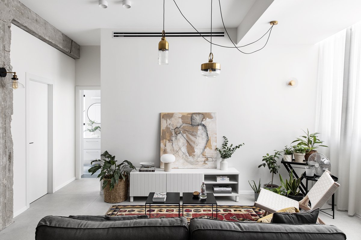
With RNS2, the entrance storage unit is where you can store your keys and bag, hang your coat, and take off your shoes while sitting on the bench. The team uses similar white-coloured design elements in contrasting textures to spice up the living space. A beautiful column and beam have been stripped from the plaster to expose the raw concrete underneath is a focal point of the design. This echoes the flooring tiles, which also simulate smoothed cement flooring.
In contrast, RNS1 does not have an entrance storage unit but instead has small in-wall storage space for hanging jackets and storing items. Without the storage unit, the team installed larger windows that look into the study from the waist level up, allowing for more natural light to filter through. Instead of cool-coloured cement flooring, RNS1 features a striking herringbone pattern throughout. It will become evident as we explore each of the living spaces that the owners or RNS1 prefer bolder contrast in comparison to the couple residing in RNS2.
The flooring is a striking herringbone pattern in RNS1.
RNS2 opts for a large communal space instead of a balcony, and the plaster is stripped bare to expose the concrete underneath.
The couple in RNS2 preferred a larger communal space instead of having a balcony. The U-shaped kitchen revolves around a dining table, creating a cozy vibe with a separate dining table instead of having it positioned at the end of the kitchen island like the setup in RNS1. The kitchen’s cabinet doors are a mixture of opaque olive-coloured plates and thin masterline glass with black frames. RNS1’s kitchen cabinets offer more open storage spaces built into the cabinetry, making it easy to grab spices and other items from the kitchen while cooking on the stovetop on the kitchen island.
RNS1 has a large kitchen island with a built-in stovetop, and the dining table is positioned at the end, looking out onto the balcony.
The RNS2 kitchen forms a u-shape around the dining table, creating a cozy vibe .
The study room’s glass walls help to transform the space both day and night. During the day, natural light flows through to the communal area, while at night the gentler atmospheric light is emitted from the study room’s glass strip into the social area. The study room can be easily transformed into a nursery went the time comes and the closet is designed at a height that allows light to come in from the communal area, while its mustard colour would be a neutral colour whether it’s a boy or girl in the future.
The RNS1 study has more table space with one desk placed next to the window, allowing both husband and wife to work in the same space.
The mustard colour closet in the study makes it easy to transform the study into a nursery, while the lowered height exposes a strip of natural light coming in from the communal area.
The living room and kitchen are packed with green vegetation, both decorative and herbals for cooking. The harmonious colour scheme is composed of shades of light neutrals, mostly white, light grey and straw, establishing a boho-chic vibe with accents of colour through the use of textiles.
The RNS2 bedroom is awash in white, using different textures in the pillows, closet, and even the wall paintings to add texture to the space. A closet niche houses a pop of greenery in the space.
The bed is placed against the opposite wall in RNS1, and here we see vibrant red used for the closet versus a neutral white palette.
While the bedroom is in the same place as RNS1, the layout is different in that the bed is on the opposite wall and similar to RNS1, the closet also holds a niche for the window. The bathroom here in RNS2 is slightly bigger with a utility closet for the washing machine, which has an open shelving unit to store items. The shower features light grey terrazzo tiles while the rest of the room is more mellow with white and green tiles. Compared against the bathroom in RNS1, where the shower is located at the far end of the bathroom and used to be a semi-open balcony, we prefer the lovely blush pink tiles against the chic black faucets and handles. Curved glass is used to transform what used to be the semi-open balcony into the shower space so the bathroom is always flooded with natural light.
The shower space in RNS1 features chic black hardware against blush pink, with curved windows to draw light in.
The RNS2 bathroom is more minimalist in comparison, with a black steel frame glass shower and white cabinetry.
These 2 apartments show us how different personalities and preferences can create drastically different and unique outcomes when we truly work to make a space our own. It makes us wonder what we would discover if we were ever to venture into our neighbours’ apartments that have the exact same layout as ours. This could be an interesting exercise to spur our creativity. Don’t you think?
PROJECT DETAILS
Architect: WE Architects
Project size: 60 m2
Completion date: 2021
Project Location: Reines, Tel-Aviv
Photographer: Itay Benit


