Aeon || This 550-Year Old Barn Turned Futuristic Duo-Tone Hotel in South Tyrol Connects Between Worlds

The new boutique Aeon Hotel located in South Tyrol, Italy, is the actualization of the saying “you stay on your side and I’ll stay on mine”.
One look at the interior design and the boundaries are clear. The sharp duo-tone interior design connects guests between moods and worlds. Whether it’s public spaces like the corridors leading to the guest rooms, or the wellness lounge area, and into each individual guest suite — the moody navy blue is sharply contrasted against a soft, light beige. If one of you is being moody, well, they can stay on the dark side.
The prime location affords views from the Sciliar to the Rittner Horn,all the way to the Merano Alps and the Dolomites.
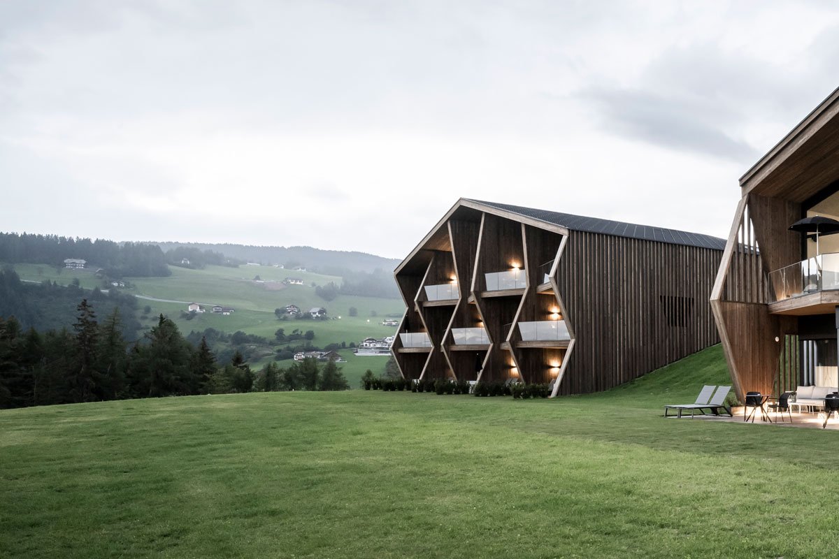
The site was home to the historic Lobishof, a perfect ensemble of an old inn, residential house, and a 550-year old traditional barn nestled between the thickets of a forest and on a grassy meadow. There is ample space for the architectural team to let their creativity run wild, but instead, they chose an approach to create two flowing structures to form the picture of a gentle, open courtyard.
The first building houses the shared areas including the reception, bistro, bar, and wellness area. The second building houses 15 boutique guest suites. The view from the outside is one of a flowing meadow with two separate buildings, but an ingenious detail — a hidden hallway tucked underneath a man-made hill — connects the two structures.
The hallway connecting the two buildings is tucked away under the man-made slope.
The two buildings also establish a strong bond by sharing the same design language. Traditional gable roofs and reinforcing slanted elements replicate the design of the traditionally listed barn but with a modern take. The structures present unique perspectives when viewed from different angles. Viewed from North to south, the building appears homogenous, whereas an east-west view shows a much more dynamic structure that breaks strongly to the outside.
The architecture also pays homage to the family’s history, with details that tie back to the family’s legacy, such as utilizing wood from the farm’s own woods to build the new structures and an entrance portal made of black steel bears the family’s old coat of arms from 1464 on the outside.
In the public area building the beige colour represents the ground and the mystical blue the skies. The delineation is executed across every aspect of the interior.
The hallway corridor is akin to stepping in between two worlds as the colours wrap from floor to ceiling.
While historic stories and the environment tell the story of the exterior, the interior design presents a striking experience for guests. Stepping inside, guests are immersed into a futuristic environment, where the interiors are characterized by a colourful, horizontal dichotomy. This expressive, clear-cut division is present in both buildings, once horizontally and once vertically.
The two chosen colours represent two differentiated personalities. A soft beige communicates feelings of being grounded, familiar and delicate, whereas a mystical blue embodies the future, the mysterious, and the uncertain.
The suites showcase the duo-tone design with one-third of the room in mystical blue and the other two-thirds a soft beige for a grounded, delicate feeling.
The perspective from different angles of the room conveys the story of two entirely different worlds.
“Verticality and linearity are the leitmotivs of two strongly contrasting design approaches – at times creating the feeling of floating between worlds.”
In the public area building, the division is at eye level, at a height of 1.6-metres. It’s as if one is standing on the ground but reaching for the mysterious dark blue skies. The contrasting cut is not confined to the walls, but is represented in the furnishing as well; heavy drapes, lamp fixtures, and other items bear the striking duo-tone look.
The wellness area inverts the colour relationship. With the blue on the bottom representing the sea.
The sauna.
The wellness area, located on the first floor of the building, inverts the colour relationship so that the blue, a symbol for water, is now below. The spectacular, half-covered outdoor infinity platform can be reached via a platform, the top which marks the “water’s edge”, acting as the boundary for the blue and beige.
The highlight of the accommodations is the Gallery Suite with its double-height ceilings.
The Gallery Suite’s internal staircase leads up to a living platform on the roof, where you can watch the sky through the skylights.
The second building housing the 15 guest suites showcases the vertical delineation, where one-third of the room is blue, and two-thirds is beige. Feeling moody? Roll over to the dark side. Feeling grounded and relaxed? Sink into the beige sofa. The sharp separation using the two different colours allows one to fully immerse themselves in the opposing moods. Here, as in the public building, the execution also involves the fabrics, materials and furnishings, creating an in-between world one can freely move between.
A bird’s eye view of the serene property where one can escape to not just one, but two, worlds.
PROJECT DETAILS
Architecture & Interior Design: noa* network of architecture
Location: Soprabolzano, South Tyrol (Italy)
Completion: July 2021
Photos: Alex Filz
Photos Drone: Andrea Dal Negro


