BOX || A New Concept in the World of Self-service Stores

Imagine picking up your packaged delivery at a self-service store equipped with fitting rooms for you to try your online purchases.
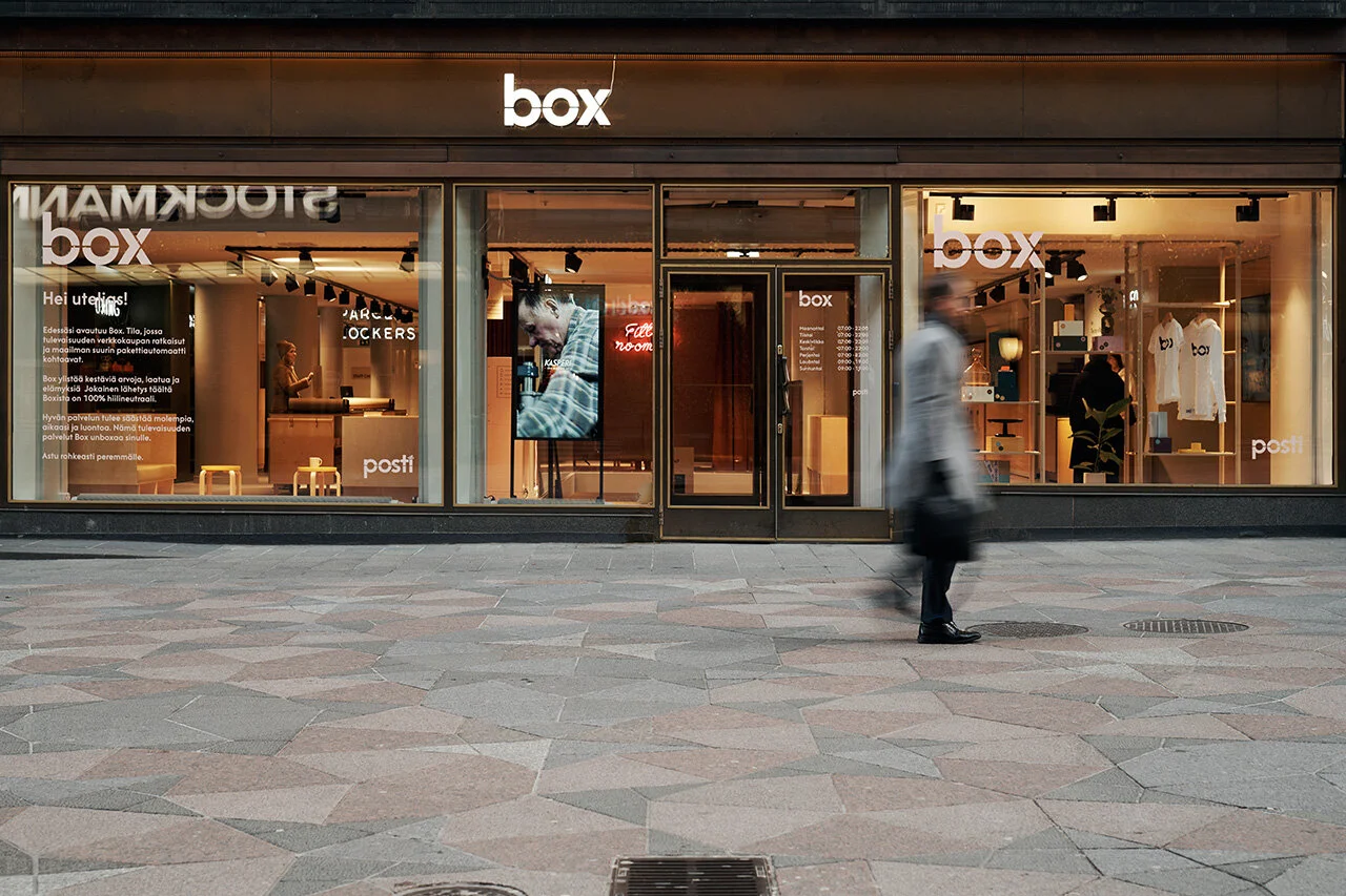
Posti, Finland’s leading postal and logistics company recently opened its new self-service store, BOX, in the heart of Helsinki. With the growing popularity of online shopping in the country and internationally, the concept of a self-service postal office featuring a cohesive and user-centric brand experience was born. Fyra, a local architecture and interior design studio, was commissioned for the project. Experts in the field of human-centered interior design, Fyra began their search for the answer to what one would look for in the perfect self-serve store.
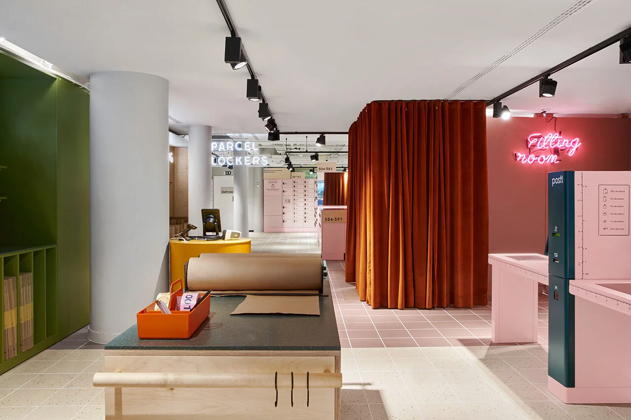
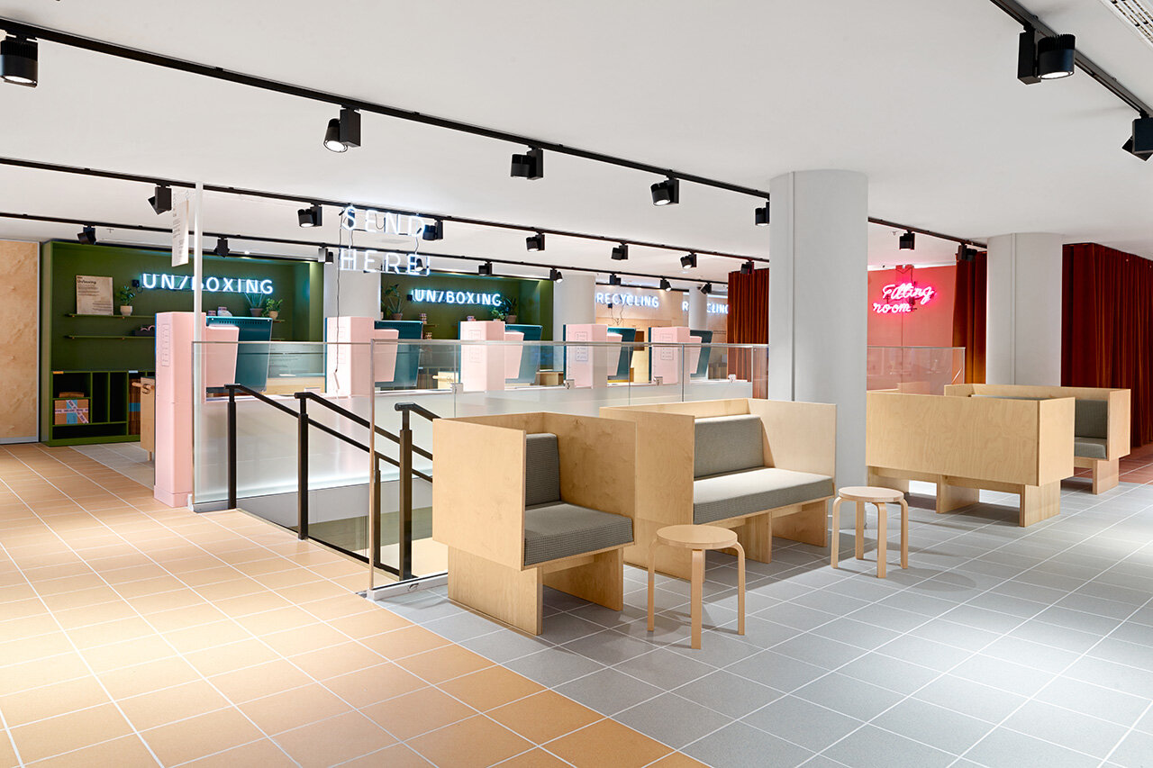
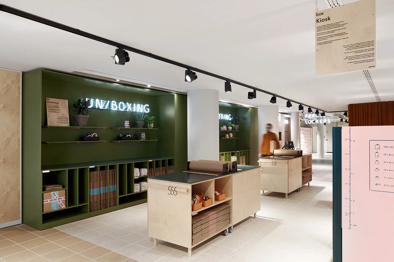
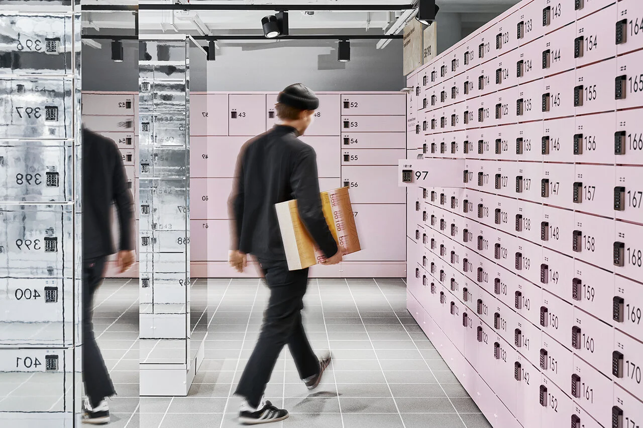
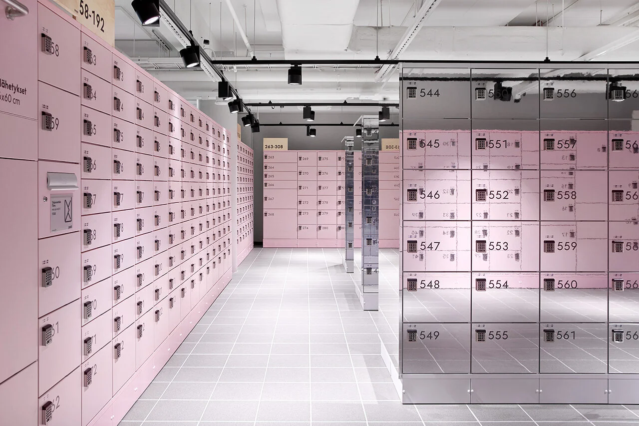
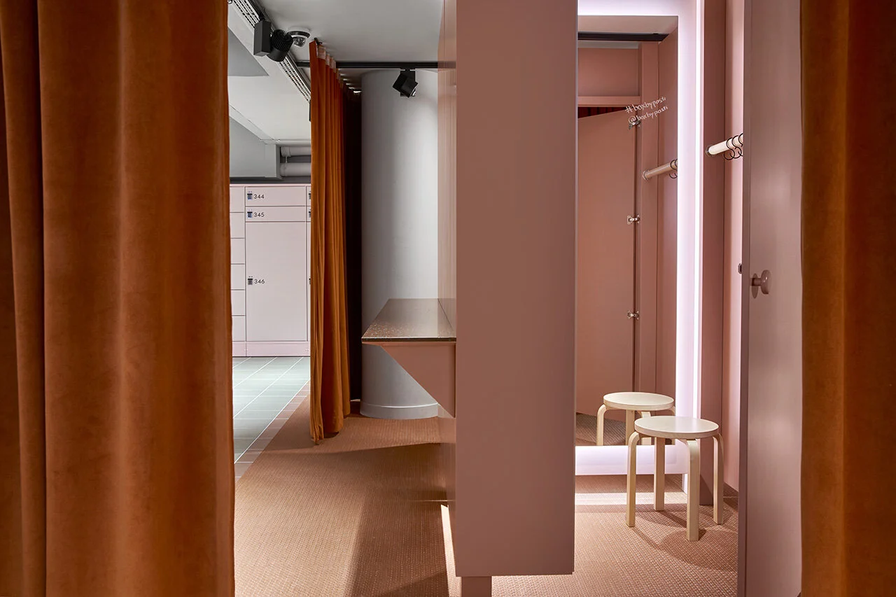
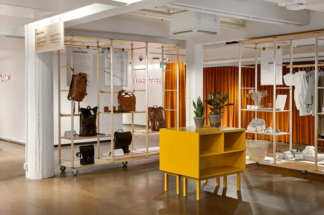
One of the key challenges was that the space in central Helsinki needed to accommodate over 600 parcel lockers. On top of that, it needed to be something more than just a row of parcel lockers. With this in mind, thoughtful and functional designs such as customer fitting rooms to try on their online purchases, couches and a lounge to enjoy a cup of coffee, as well as space for online companies to present their products to consumers are integrated to accommodate the needs of modern shoppers.
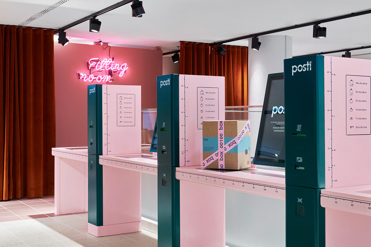
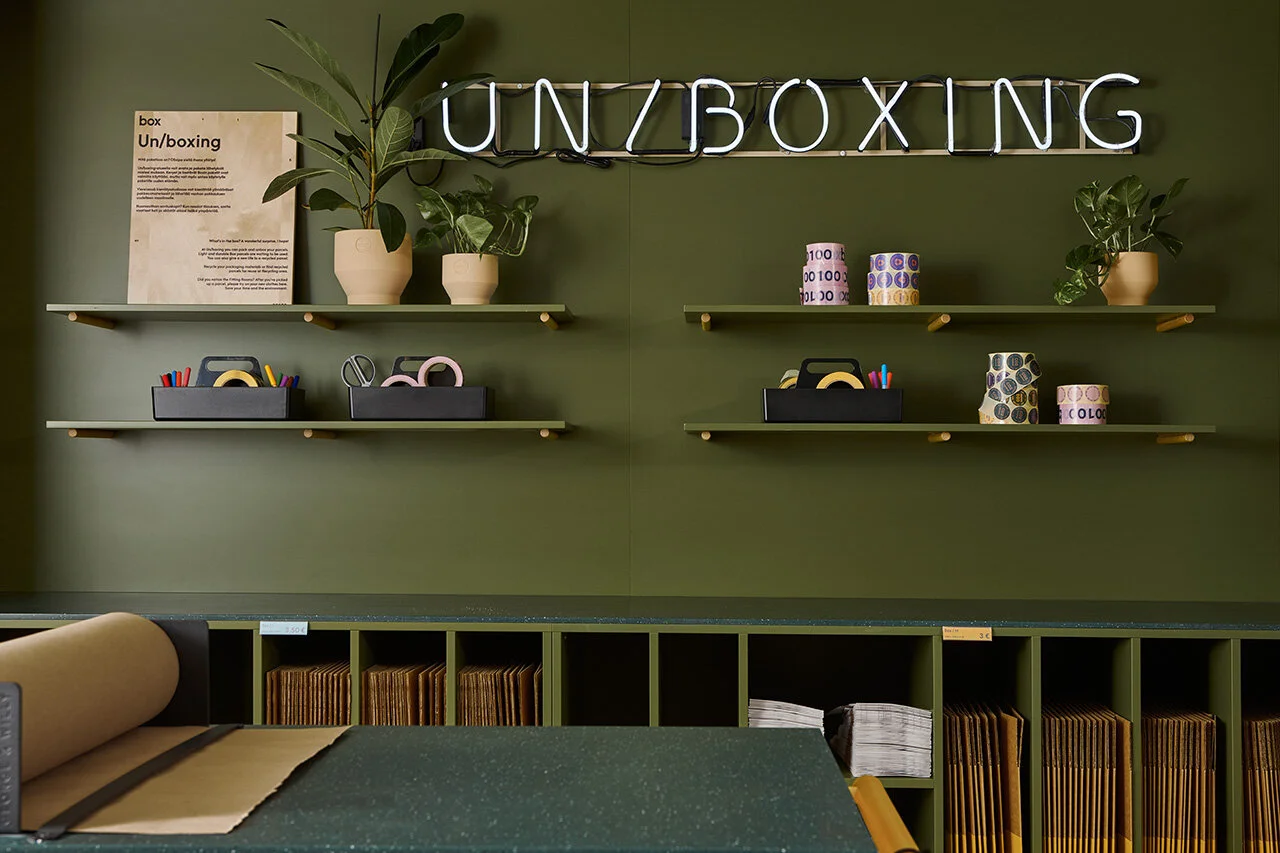
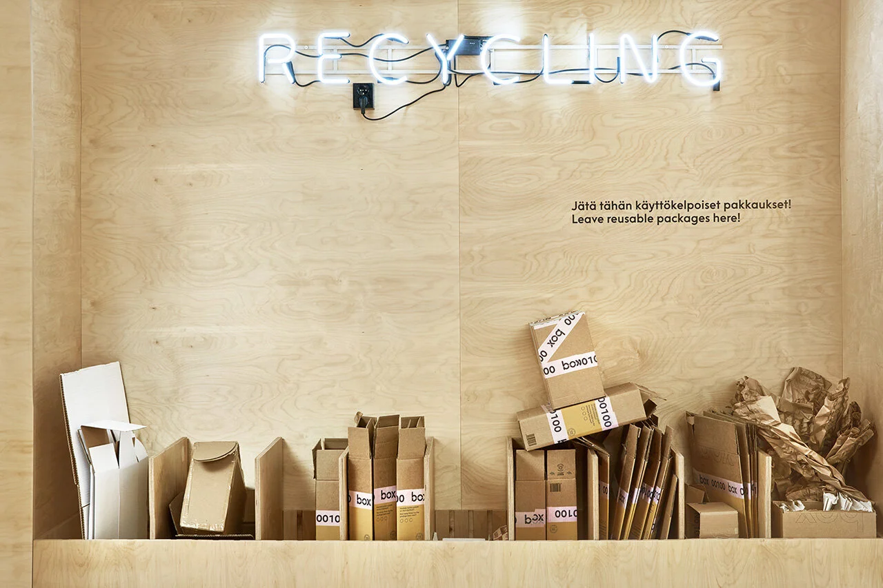
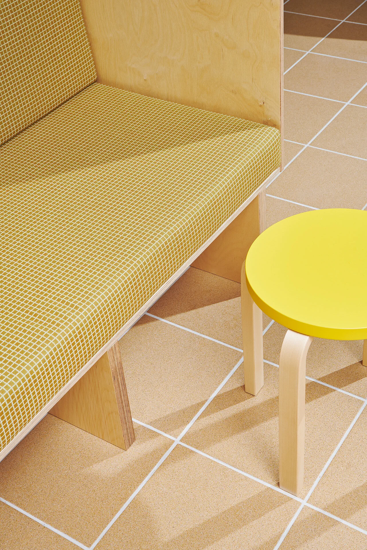
The overall concept of BOX was developed in close cooperation with the consulting company, Motley, who brought Fyra onboard for the interior architecture design. The final result is a colorful yet harmonious space where different colors are assigned to different activity areas. Complete with bright neon marquee lights defining each space, the store allows users to easily and intuitively navigate their way through the self-serve process. An entire section is also dedicated to the recycling of packaging materials, which sits adjacent to the boxing and unboxing zones. The intuitive placement provides customers with a coherent workflow as they can quickly make their way to dispose of their waste after unpackaging their goods.
Having satisfied the key deliverable of creating a functional and intuitive space, the team also designed a visually compelling interior that reflects Posti’s renewed identity to introduce a new and refreshing side of the brand to its users. The playful combination of colors and neon lights draws attention from curious passersby looking in from the street. Who could imagine a self-serve post office would be so much fun?
Over 600 parcel lockers of various sizes allow users to pickup their parcels with a pin code.
Fitting rooms for users to try on their online purchase.
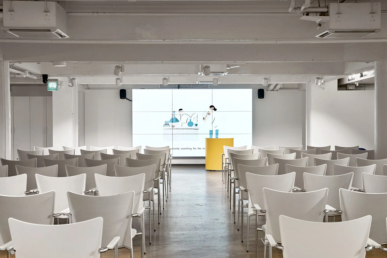
Tucked inside BOX is a separate area called ‘Spotlight’, located towards the front of the store. The spacious room is designed to be a presentation space where online companies can present or demonstrate their products to consumers. Recognizing the evolution of e-commerce and the demand for pay-per-use presentation or conference spaces, BOX provides modern businesses today the flexibility and convenience they need in the heart of the city.
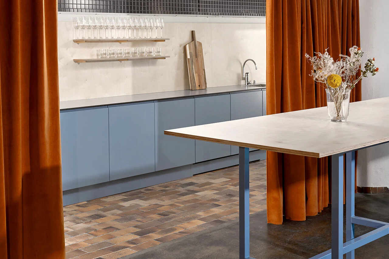
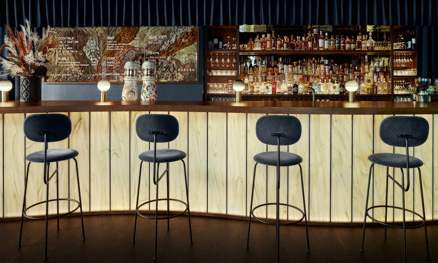
Although the store is meant to be self-serve in nature, onsite staff stationed by the entrance of the store are always ready to help. A resting area offers couches for customers to relax with hot tea or coffee. A separate self-serve beverage bar provides clean cups for users to prepare their own beverages.
The injection of thoughtful and playful details into the interior for guests to navigate the self-serve store is a great example of a user-centric design that is both functional and aesthetically pleasing. With an expected increase in online shopping in the years to come, we are excited to see this refreshing concept take the world by storm. To learn more about BOX by Posti, visit here.
Project Details
Project Name: BOX by Posti
Interior Design: Fyra
Consulting Partner: Motley
Photography: Riikka Kantinkoski

