DABPA || This Peking and Szechuan Restaurant Offers a Unique Calming Environment to Enjoy the Spicy Cuisine

What would you imagine a Peking and Szechuan Cuisine restaurant to look like?
Szechuan is known for its spicy foods, often where plates are filled to the brim with piping hot red chilli. One may imagine a Szechuan restaurant’s design aesthetic to reflect that with bright, bold colours, but what comes as a pleasant surprise is Minus workshop’s opposite and unique take on how to create an atmosphere to house the Szechuan dining experience.
Kevin Yiu, the founder of Minus workshop, treats each design like a story to steer the guests’ visuals beyond their imagination. For Dabpa, he created a highly expressive and embracing appearance for the Peking & Szechuan Cuisine restaurant, Dab-pa. The first one was in Shatin, Hong Kong, and now this new location is in K11 Musea, the artistic shopping arcade in Hong Kong. It is inspired by the milky way, with a textured white canvas providing a backdrop for elements that suggest geologic formations throughout the space.
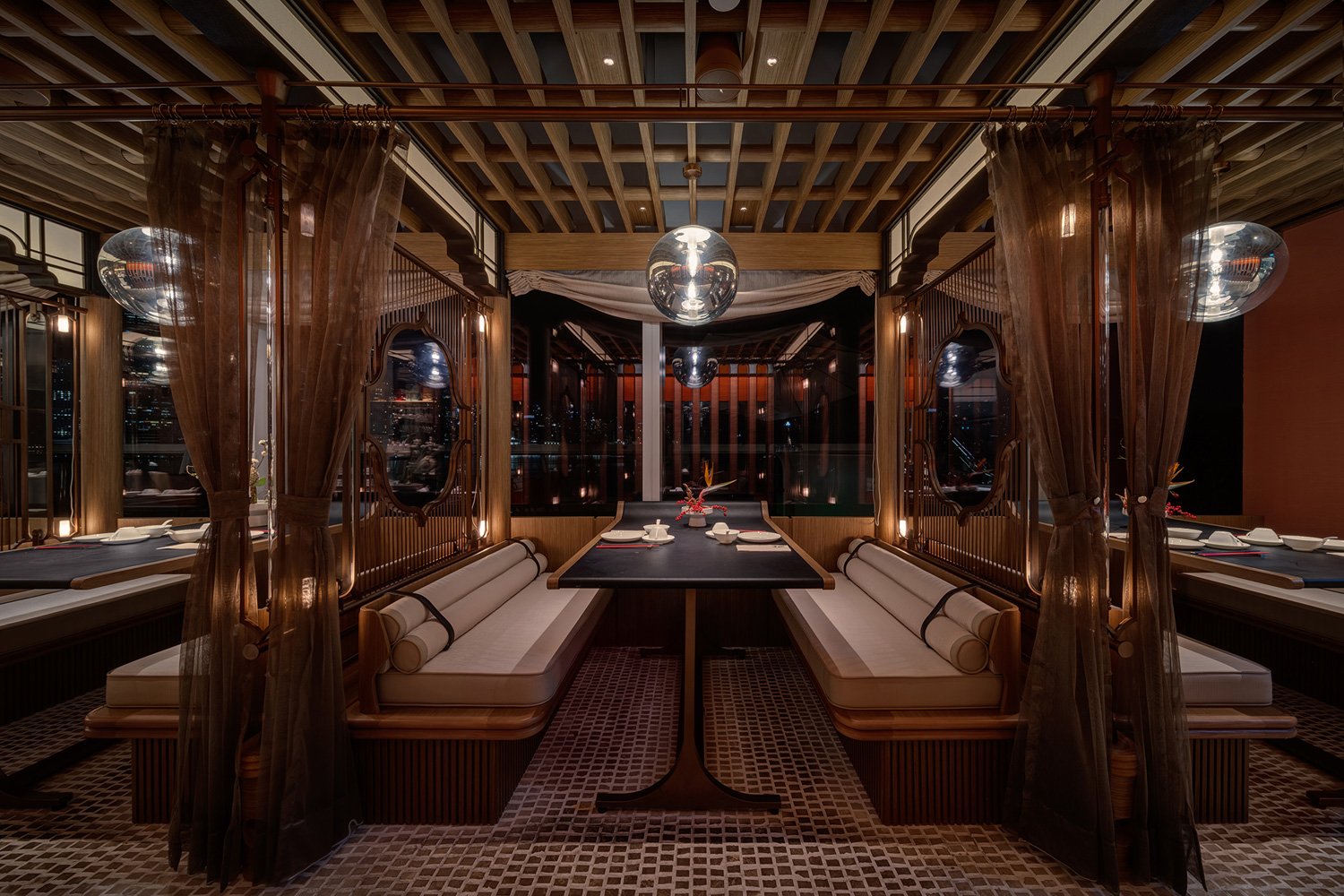
The semi-private rooms at Dabpa.
The harmonic pastel colourant is distinguished from the other Szechuan restaurants in that the entrance extends the length of the exterior. Passersby are able to see clearly into the restaurant to examine the rooms; irregularly-shaped window openings allow guests to look out and those interested in dining at the restaurant to peer in. Don’t we often walk by restaurants curious about the cuisine? Dabpa offers a glimpse of what to expect from the design to the food before guests decide to enter.
The calming environment is in contrast to the cuisine which takes on bold flavours. The various geometric forms present on the wall, ceiling, and throughout the space present a diverse yet amicable unity of form. A semi-private room offers intimacy and privacy while still offering interconnectivity between the outdoor and indoors.
Light shines through the curtains above to create an ethereal dining atmosphere.
The furniture’s fluid shapes create an interplay of textures and forms.
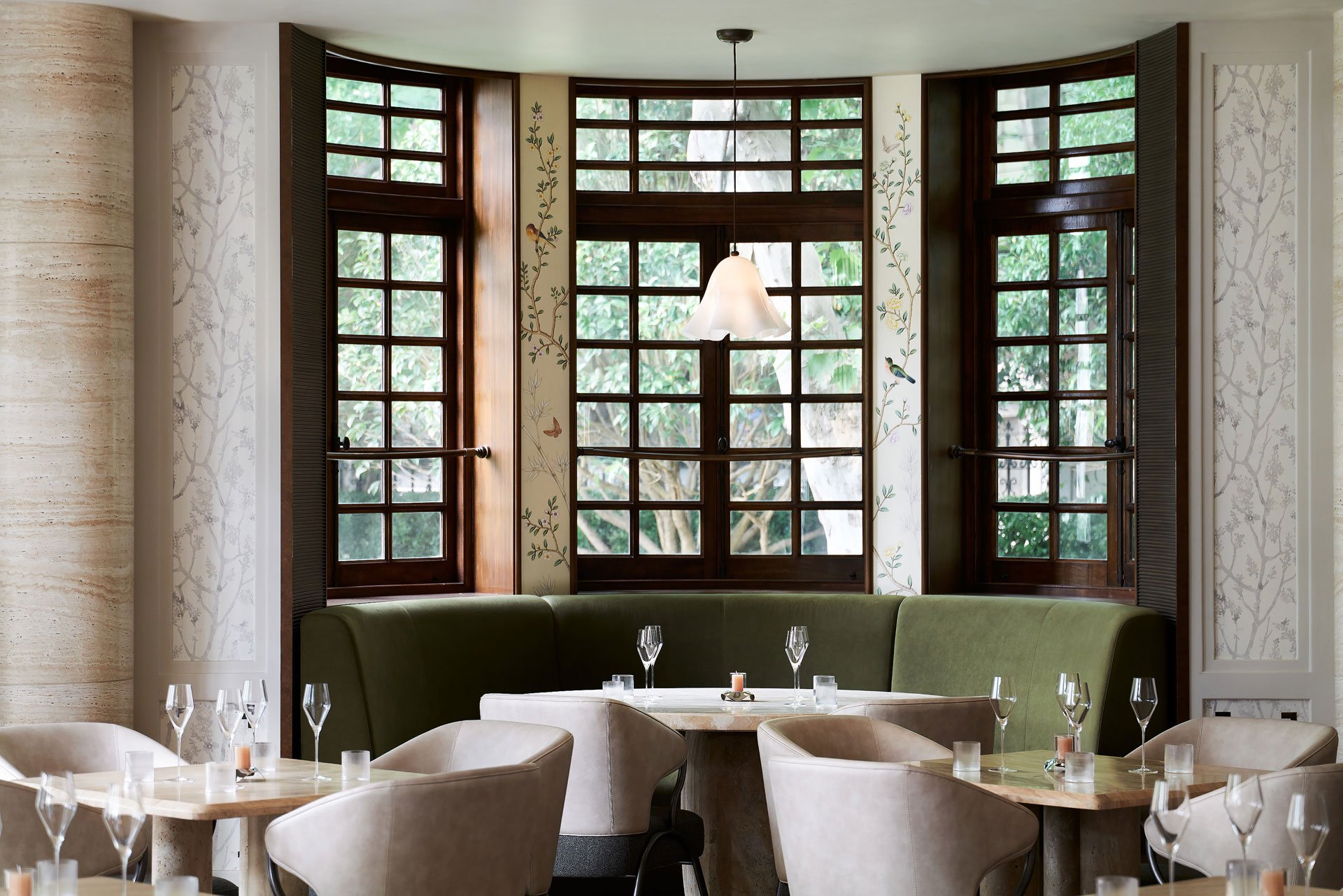
While the dining room seems to be enveloped in a sea of milky white, dramatic elements such as an overhead lantern, mercury-like amalgam mirrors installed into the walls and columns, a contorted sofa, curved tables and transparent, fluid furniture add a whimsical element to the dining experience.
The irregular curves in the ceiling elements and furnishing are used to emphasize the lines one would discover in nature, which simply flow together. Adding another mystical element, white trunks are dominant elements at the entrance, as a part of the ceiling installations and as a partition to each pavilion.
The dining room is not what one would expect of a Peking & Szechuan restaurant with bright, bold flavours but that is exactly what is unique about it.
The designer utilizes earthy colours and a mix of textures and lighting techniques to create layer up on layer of texture for the dining space.
The façade, interiors, and detailing together establish a dreamscape that intrigues all the senses.
From the wavy ruffles in the ceiling where light gently sifts through to illuminate the dining area, to the coconut shell wallpaper hand-picked by the designer, ripple textured walls and stepped wall deco to accentuate the layers of the design experience, everywhere you look and touch embodies part of the design story.
The space brings the tagline of the restaurant to life: “Everything is beyond your imagination.”
PROJECT DETAILS
Project Team: Minus Workshop
Project Size: 1300 ft2
Completion Date: 2022
Building Levels: 0
Photography: Steven Ko


