VELORETTI || The Amsterdam Brand Store Gets a Modern Redesign with a Focus on the Tactility

Bicycle brand Veloretti has re-opened its Amsterdam brand store with a redesign by S-P-A-C-E.
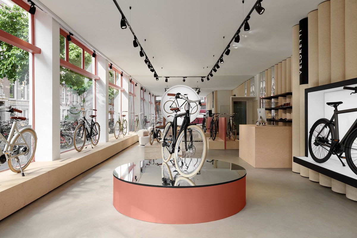
The redesign is fit for the future. After recently releasing their first electric bikes, Veloretti collaborated with Amsterdam-based studio S-P-A-C-E on a fresh design for their brand store, inspired by their recognizable bike frames.
The redesign gives the shop a modern look with its more tech-oriented approach.
The new look modernizes the store and speaks to the brand’s diverse product offerings. With the addition of their Electric bike range, Veloretti sought to combine their playful aesthetic with a more tech-oriented approach. This translated to the minimalistic design with geometric shapes and a material palette focusing on tactility with softwood, high gloss laminate, and travertine.
One of the most recognizable elements of the renewed store is the tube wall, referencing the iconic bike frames from Veloretti's city bikes. In contrast to the hard materials of the bikes, S-P-A-C-E has chosen a felt finish for the wall, making the tactility of both the products and the store a recurring theme.
The felt finish wall emphasizes the tactility of the store as a recurring theme.
“Veloretti is a fashionable bicycle brand, which I wanted to emphasize in the store. Where fashion brands have (stainless) steel walls and soft fabric products, I did the reverse for Veloretti.”
The new look presents a soothing aesthetic with its felt finishes and geometric elements, and will undoubtedly catch the eyes of passerby to draw them into the store to discover the brand.
PROJECT DETAILS
Project Team: S-P-A-C-E
Project Location: Amsterdam, Noord-Holland, Netherlands
Store Address: Van Woustraat 72, 1073 LN, Amsterdam
Project Size: 100 m2
Completion Date: 2021
Photography: Kasia Gatkowska


