PERFECT STORM || Make Room for What You Need and Nothing More.

The concrete bunker.
This Camperdown apartment’s deliberate use of rendered finishes and rejection of ornamentation gave it this name. The project was designed for a couple, both design professionals, seeking a minimalist lifestyle with an interior to match. The result was a home that is intimate yet utilitarian. Inspired by Brutalism and the local warehouse vernacular, extruded geometries and moody tones result in a minimalist and precise interior.
Full-height windows draw in natural light
The owner sought to shed their home of unimportant accumulation and create a clutter-free space.
The principal intent was the creation of a pared back, geometric interior and a celebration of the neighbourhood’s industrial heritage. The west-facing open plan apartment features a custom kitchen and a mezzanine bedroom which overlooks the living room space and small terrace. The loft is flooded with light from a full height, glazed wall, counterbalancing the interior mood, which is intentionally dark and brooding.
The open bedroom on the mezzanine level creates a sense of openness.
Bold materials paired with soft curves.
The principal intent was the creation of a pared back, geometric interior and a celebration of the neighbourhood’s industrial heritage. The west-facing open plan apartment features a custom kitchen and a mezzanine bedroom which overlooks the living room space and small terrace. The loft is flooded with light from a full height, glazed wall, counterbalancing the interior mood, which is intentionally dark and brooding.
A homely “mid-century” touch has been introduced in the form of film-faced plywood and American Oak joinery, brass accents and statement lighting. The furniture selection features geometric forms and a muted palette, underscoring the overall concept.
The designers also went to great lengths to ensure the entire process considered sustainability, using the materials palette that is environmentally responsible, such as VOC-free finishes, adhering to a strict use of FSC timbers, and reducing the use of chrome and cement, and executing a construction process streamlined to minimize waste.
Gently curving lines soften the overall tone of the home.
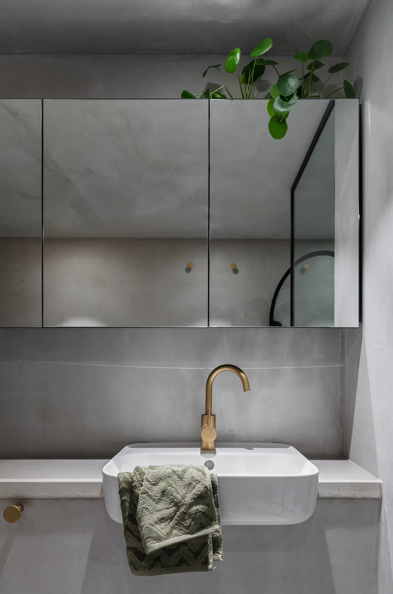
What appears to be cement to the naked eye is actually achieved with clever twist; although the client brief was a concrete box - remarkably very little cement has been used in the creation of the home. The “solid'“ concrete elements are Glass Reinforced Cement (GRC0 - which has far less weight and cement than traditional concrete techniques. The “concrete finish” has been achieved with a French Wash Porter’s Paint.
Chrome accent and rounded sink bottom.
The challenge with the concrete bunker was in its restrained and pragmatic design approach, as the hardest task is to keep things simple while still implementing a creative execution. Here, the design details are subtle and unfussy, incorporating the use of curvature into the interior design, furniture and other hardware to tone down the rigidity of the concrete look and feel.
If homes had a personality, the concrete bunker would be an introverted softie; closed and cold at first glance, but upon closer examination a gentle heart and a big softie on the inside - what do you think?
Use of curves in the glass shower entry.
CREDITS
Design – Killing Matt Woods
Builder – Green Anvil Co
Photography – Kat Lu
Styling – Madeline Mcfarlane


