SCANDINAVIAN SPACESHIP || Spaceage, Futurism and Scandinavian Lines

Just reading the project name told us we were in for a visual treat.
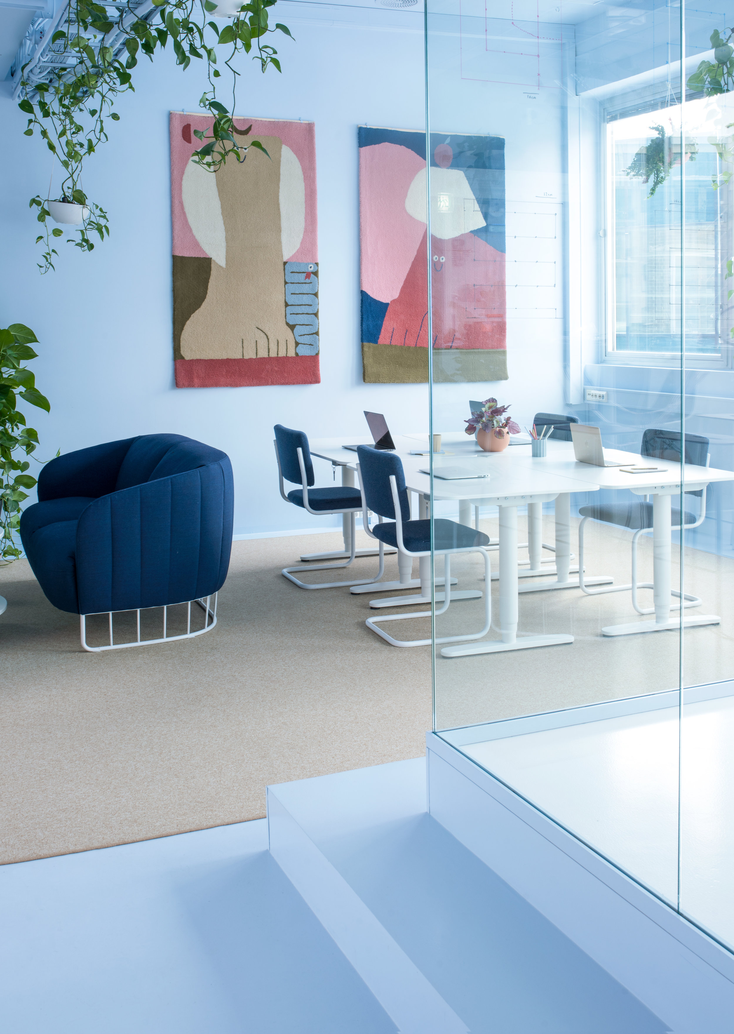
Wander into this futuristic office space and it’s like you are staring at a soothing colour palette, as the powdered and vibrant colours make their way onto the walls and the ceiling, creating a uniform presentation.
Norwegian design studio Kvistad recently completed a major upgrade of Bakken & Bæck’s HQ office in Oslo. The unconventional office interior is a union of spaceage, futurism and friendly scandinavian forms. A lot of ideas are taken from spacefaring vessels.
When asked why the team chose to marry the futuristic elements with Scandinavian design for the new B&B office, they shared “We combined and explored different styles and interior elements that we're fond of; 60s/70s warm futurism and the honest lines and natural forms of Scandinavian design. Moreover B&B is a fun, forward-leaning design and technology company which also suited this aesthetic.”
It all began with the team falling in love with the Azure Blue.
All floors, walls and ceiling are painted in the same colour, to give a feeling that everything is molded in the same material. Some rooms have carpets on floors expanding to cover the walls, suitable for a zero-gravity environment. Many of the details are supported by thin lines to resemble weightlessness. Bakken & Bæck have been growing fast the last years, so naturally more office space were needed. Kvistad developed the interior concept "Scandinavian Spaceship"—a union of spaceage, futurism and scandinavian lines.
Many ideas are taken from space faring vessels: All floors, walls and ceiling are painted in the same colour, to give a feeling that everything is molded in the same material. The wall rugs shown in the image below are also designed by the team and available for sale at their shop.
The two vibrant wall rugs are available for sale on Kvistad’s online shop.
When asked how the team decided on the variety of colours they used for this eclectic workspace, they said it all began with them falling in love with the Azure Blue colour; the rest of the colours were chosen to complement this base colour, and also for their ability to create a calming work environment that makes it easier for staff to concentrate. Once the team had their base colour, they integrated the spaceship concept, where “just like a spaceship, where what is up, down, right and left can be relative.” This is why the Azure Blue is found on all the walls, including the ceiling, which gives the entire space a sense of continuum and connectivity.
The office kitchen.
When the team says they pushed the idea forward to colour the floor, walls and ceiling with Azure Blue, they didn’t stop there. The colour even canvasses the various nooks in the kitchen space, from the sleek kitchen counter and even the bottom of the kitchen sink and the faucet.
The consistent use of Azure Blue gives the overall space a sense of weightlessness, even the hardware including faucets and the kitchen sink and other elements made of aluminum or steel are powder coated to maintain the overall vibe.
Even the bottom of the sink is a calming Azure Blue.
Thin wires are used to hang potted plants from the ceiling both to breathe life into the otherwise futuristic space and to add to the sense of weightlessness, as the potted plants appear suspended in mid-air. The pops of green also work to add vibrancy and energy to the otherwise calming space.
The furniture selection also works to complement the weightlessness theme, such as the armchairs, work station chairs and kitchen table chair which all have thin supporting lines as their base frame.
While the calming Azure Blue canvasses the majority of the work environment from the kitchen to the meeting rooms and work spaces, different colours are used to colour-block the office into sections, such as the Sauna Room awash in a warm, earthy-red tone.
A futuristic circular doorway leads into the Sauna Room, where the team has designed everything from the pillows to the mattresses, sourcing fabric from the Danish company Kvadrat and using all fabrics that are 70 to 90% wool.
Similar to other areas of the office, the colour finds its way onto the walls via the lush fabric and onto the ceiling and even the light fixture. An expansive window opens the room to draw in natural light, reflecting against the wall fabric giving it a natural sheen.
Who wouldn’t want to have a meeting in the Sauna Room?
Details in the ‘sauna room’.
For the powder room and bathroom quarters, the team used a peachy pink that contrasts and complements against the Azure Blue and earthy-red to section off this area, signifying to staff and visitors that they are entering a different zone.
Everything down to the door knobs and even the wall bricks are covered in the peachy hue - an uplifting, happy colour to match with the energizing feeling one would feel as they freshen up throughout the day.
Kvistad Design Studio has created a uniquely uplifting office space that workers and clients alike will look forward to visiting. Going to work every day in this vibrant workspace is a treat and definitely not a chore, we are jealous of all who have a chance to work in an office with such character.
Photos courtesy of Kvistad


