CUBITTS || A Nostalgic Interior within an Opulent Victorian Arcade

Have you ever wandered down a retail corridor and been captivated by a storefront?
The light-filled, ornate shop design by London-based Child Studio for British spectacle makers Cubitts is one such storefront. Chocolate gloss lacquer against pink Sienna marble columns presents an elegant palette with a vintage feel. Located within the ornate Grade II-listed Victorian shopping arcade in Leeds, the interiors create a nostalgic atmosphere, paying homage to the design heritage of the North of England.
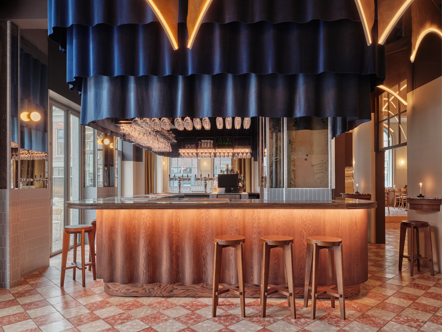
The airy interiors feature clay tiles in various shades of terracotta, sand and anthracite tones.
The shop is nestled on the corner of the County Arcade in the Victoria Quarter district. Built in 1898 by the renowned theatre architect Frank Matcham, this opulent structure features pink Sienna marble columns, gilded mosaic ceilings, wrought iron detailing and mahogany shopfronts with curved glass facades. Child Studio aspired to celebrate the unique heritage of the building, whilst introducing a contemporary interpretation of the arcade’s architectural language.
The facade signage was hand-crafted by a local artisan using the traditional ‘Verre Eglomise’ technique.
“New interiors within historic structures often fall into a pastiche or offer a sterile minimalist look that doesn’t attempt to engage with the context. We wanted to take a more subtle approach and to build a layered narrative that would acknowledge different chapters in the building’s history,” commented Child Studio founders Che Huang and Alexy Kos. “We tried to imagine how the space could have evolved organically over time, fusing the Victorian cabinetry features with the Art Deco elements and Modernist references.”
The curves of the 3-metre tall cabinets mirror those of the elegant eyewear on display.
“Child Studio is always looking for an authentic story at the core of the project, aspiring to create something meaningful and timeless. Tactility and craftsmanship are incredibly important to us: every detail in this interior is bespoke and based on careful research. Balancing heritage and modernity, this project aims to provide an intimate and informal destination for this historic neighbourhood”, added Alexy and Che.
The store interior is wrapped in a series of dramatic 3-meter tall display cabinets that echo the geometry of the original shopfront. The chocolate brown gloss lacquer finish contrasts with the off-white textured wallpaper that lines the illuminated display shelves.
Octagonal bakelite clock produced in the 1930s by the British company Genalex.
The custom-made cashdesk was designed to resemble a writing desk, referencing the classic pieces by the celebrated furniture designer Robin Day. The reflective black glass tabletop is supported by the stainless steel base and the cherry wood storage cabinet.
The space features a striking geometric floor pattern, which was inspired by the arcade’s original architectural faience detailing produced by the local Burmantofts Pottery Company. Child Studio used clay tiles in various shades of terracotta, sand and anthracite tones, in a nod to the materiality and colour palette of the arcade’s architectural features.
The custom cashdesk references classic pieces by Robin Day.
The designers sourced a selection of antique furniture pieces for the space, including the “Monk” leather chair by Tobia Scarpa, the “Jumo” table lamp designed by Eileen Gray and the octagonal bakelite clock produced in the 1930s by the British company Genalex for schools and factories. The facade signage was hand-crafted by a local artisan using the traditional ‘Verre Eglomise’ technique with gold leaf applied to the black glass.
From colour to material and furnishing selection, Child Studio’s efforts to create a nostalgic interior paid off, resulting in a retail storefront that effortlessly captures the attention of those passing through the arcade. The open design with products facing the street invite prospective shoppers to stop and regard the goods on display. In our opinion, this design makes the art of window shopping even more enjoyable. What’s your take?
Photos courtesy of Child Studio


